Harnessing the Power Of Color in a Values-Driven World
Color designer Dawn Rae Knoth shares her expertise on creating the perfect color palette for your nonprofit or mission-driven brand.
Color is one of the many tools we use every day for communication and self expression, but what makes it so powerful? Not only do we see color, we feel it and use it to create emotional connections with the things around us. Color has always played an important role in advertising and design, including in the nonprofit and mission-driven world. Color can be used to make positive associations with strong values and meaningful work and bring together people who care about finding ways they can contribute to the greater good of the Earth. To help me break down the nuances of color, I’ve brought in expert color designer Dawn Rae Knoth to answer some questions.
Margo: Why is it so important to be mindful about color when choosing a color palette for your brand or nonprofit?
Dawn Rae: Color is important because it has an immediate impact on us; it’s the first element of a visual stimulus that the brain processes. This initial impression is crucial because it’s when the subconscious starts to create opinions and judgments about a brand or product. A successful color palette will accurately convey your brand’s values and goals; it will create an instantaneous positive reaction with your audience that encourages connection and trust.
Margo: What are your thoughts on color psychology or how color emotionally resonates with people when it comes to branding?
Dawn Rae: One of the things that I say a lot is that color is a tool and it has a specific job to do for your brand. One of those jobs is to immediately communicate what’s important to your brand – values, personality, purpose, etc. In this sense, color psychology is extremely important because it’s building that emotional connection between your brand or nonprofit and the audience that you hope to reach. When we have meaningful and strong emotional connections with others – including with a brand or nonprofit – we are more likely to honor and support what they’re doing, as well as actively participate in their mission. People are personally invested in the communities where they feel they belong.
Margo: What are some things to consider when making color choices?
Dawn Rae: There’s a lot to consider when making color choices. It’s really important that your color choices create a positive emotional connection with your brand; that initial impression really speaks to a person’s soul and builds love and trust for your brand. A few things to think about:
What’s the job you want your colors to do? What key immediate emotions do you want your audience to experience when they see your brand colors?
What is the longevity of your color selection? In addition to being unique to you and immediately associated with your values, will the colors be relevant for years to come?
What are others doing? How can you differentiate from what your competitors in the same space are doing while still feeling part of the same community or industry?
How will these colors translate to different platforms? Will they hold up across printed materials and websites & social media? What about when it’s printed on different materials like vinyl banners and cotton t-shirts.
Are these colors inclusive enough? Or are they too specific and limited to a certain segment of an audience?
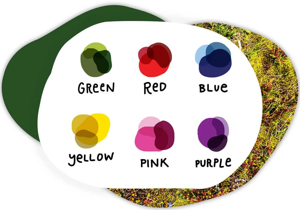
Are the colors easy to see? Are they accessible to people who are color blind or with low vision? Light, bright colors tend to be harder to see on light backgrounds and various shades of red, blue or green may be difficult for a color blind person to see. Check out Margo’s Easy Guide to Make Your Brand’s Color Palette Accessible
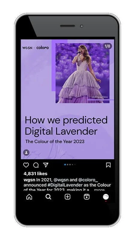
WGSN and Coloro are a prime resource for color inspiration and trends.
Margo: Where do you go for color research and inspiration?
Dawn Rae: I look everywhere, all the time. I find inspiration and insight in a variety of places and sources - daily life, nature, various media & publications, art, science, popular culture, other creatives, and color-specific resources like WGSN, Coloro, and FS. I am constantly collecting and organizing nuggets of information and inspiration that intrigue, excite, or point to bigger influences. I reference this library whenever I’m working on a project (personal or client-specific), and filter the assets based on that project’s unique goals and purpose.
Margo: How can you avoid “cliché” color choices while still using colors that will resonate with your audience for a specific cause? (i.e. blue = water, green = nature, etc)
Dawn Rae: It can be good to honor and recognize the existing associations that people have with certain colors. Choosing a color that’s already emotionally connected to a cause or certain values can be a wise decision. Remember that within any one color family, there are a multitude of color choices and variations. You can choose a color family that is associated with a particular cause, and then differentiate your brand by selecting a specific tone or shade within that color family that is unique in your industry. For example, say your brand focuses on environmental conservation. Green would be a natural choice for a dominant brand color. But you do not have to choose the typical grass green that many other eco-minded brands use. You could choose a deep fir green, a mint, or a chartreuse. Or, you could choose a combination of 1-3 green hues. Or, you could choose a combination of a green with a secondary color that more completely conveys your mission - say adding in an aqua with your green because clean water accessibility is also important in your work.
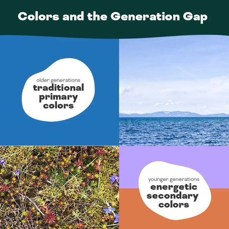
An example of a color palette that could bridge the gap between generations.
Margo: In the nonprofit world, one challenge these days can be creating a brand that appeals to Boomers and Gen X (current, most generous donors) and also to Millenials and Gen Z (current supporters and future generous donors). How can an organization make color choices that bridge these different generations?
Dawn Rae: A dynamic color combination can help a brand appeal to more than one audience. Brands typically use two to three key colors in a palette, and the most dominant of those colors could be geared towards the largest segment of your audience and the secondary colors could appeal to your prospective or smaller target audiences. If you’re looking to create a color palette that appeals to a more traditional audience like Boomers you might use a combo that conveys stability and trust – blues do this well – while adding in modern, progressive, forward-thinking secondary colors – like amber or lavender – to convey the energy and progressiveness of younger generations. It’s possible to play up or play down the different components of a color palette based on the target audience for a specific marketing piece i.e. printed mailers are probably going to your Boomers and Gen X while an instagram ad or post is geared towards Millenials and Gen Z.
Margo: There are FCC regulations that prohibit a brand from making certain environmental claims (like organic or non-gmo labels), but that can’t stop someone from using a green leaf in their marketing to indicate that their brand or product is healthy or sustainable when there’s actually no truth to it. Is it possible that colors can be used to intentionally deceive people? Like in greenwashing, for example.
Dawn Rae: Absolutely, there are no laws that would prevent someone from using color to manipulate their audience. Using color this way is a misrepresentation and can be very confusing or unsettling to people. Since we process color on the subconscious level, it’s easy for something like greenwashing to happen without even realizing it because we’re relying on an immediate impression that might not even be getting pulled into our conscious mind.
Free Guide to Colors & Emotions!
I worked with Dawn Rae to create a guide with suggestions for understanding emotional ties to color and the specific industries or niches often associated with certain colors. It’s a great 1-page resource for your next brand or color project!
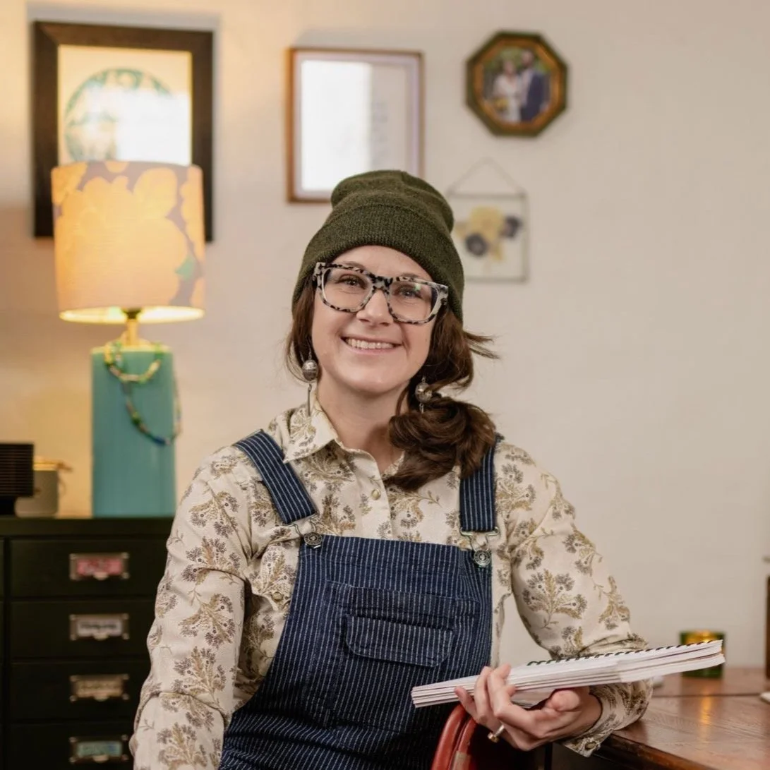
Hi, I’m Dawn Rae, a color designer + trend forecaster. For over 20 years, I have helped brands understand what their customers will love and value in the future, and have created the color + trend strategy to get them there. I design client-specific seasonal trend forecasts, color palettes, and color merchandising plans. For more info or to subscribe to my trend + color newsletter, visit and connect with me here: dawnrae.com.
I’m Margo! A graphic designer who works with environmental nonprofits and mission-driven brands on projects like logos & branding, annual reports, maps, and infographics. I work with my clients to create beautiful and meaningful design that amplifies the marketing efforts it takes to ignite action and change. Visit my portfolio to see some of the projects I’ve collaborated on with nonprofits to protect the environment.