10 Strong Nonprofit Websites that Cut Through the Clutter
Find inspiration for your nonprofit website with this roundup of outside-the-box examples.
If you’ve been following along with me for a while, you’ll remember that last year, I published a blog: 12 Environmental Nonprofits with Unique and Engaging Websites. Well, I’m at it again, I recently reviewed 50+ websites – everything from ocean conservation nonprofits to environmental justice organizations – searching for sites that were memorable and made me stop and think or even feel. After looking at that many websites, a lot of them started to look very similar – colors, navigation, photos, calls to action – and it made me realize how hard it can be to stand out as a nonprofit these days with so many organizations out there doing great things. Some organizations have done a really nice job cutting through the clutter and I’m sharing those with you so you can find some inspiration of your own. In my review, I considered things like logos & branding, graphics and iconography, calls to action, photos or videos and unique engaging content.
Check out these neat examples:
What I Like About This Site: The organization’s mission is front and center, overlaid on a photo that supports that mission. The composition really demands your attention and the wave shape graphic invites me to scroll down to keep reading. Below the fold, there’s a wonderful balance of stats, photos, video clips and program information. The color palette is uplifting and functional. Everything feels really well thought-out and easy-to-navigate.
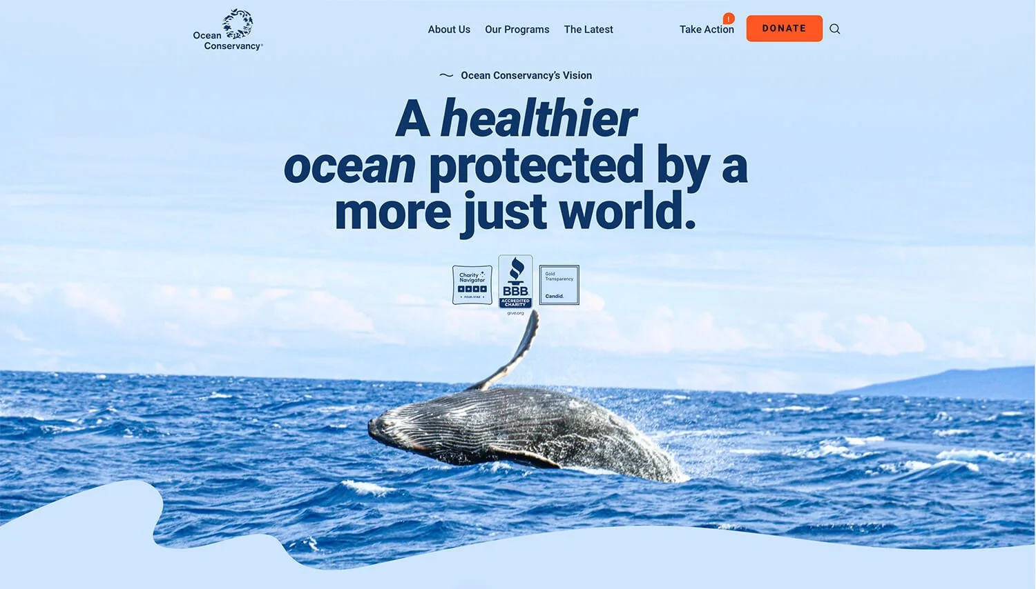
Ocean Conservancy works to protect the ocean from today’s greatest global challenges. They create evidence-based solutions for a healthy ocean and the wildlife and communities that depend on it. (source: oceanconservancy.org)
What I Like About This Website: It’s amazing how some government websites can send you in a downward spiral of confusion and frustration while others can be clever, approachable and engaging (similarly, in my 2023 website review, I shared a project with the US Forest Service: Vibrant Cities Lab). The ACC website is the latter because it needs to successfully appeal to young people entering the workforce. They accomplish this through their logo and branding – which has a retro hipster vibe – and the color palette which says “yes, we’re shades of serious government colors but applied in a fun and approachable way!” The site is straightforward and easy-to-navigate. Within 10 seconds I know how I can search for a job and get updates about the new program. This is a nice website and especially nice considering it’s a product of the government. P.S. This article from Fast Company talks more about the ACC branding process.

ACC is the US Government’s workforce training and service initiative that aims to put tens of thousands of young Americans to work fighting the impacts of climate change and training a clean energy and climate-resilient workforce. (source: acc.gov)
What I Like About This Website: The color palette tells you right away that this isn’t your typical climate change organization. The spinning watch graphic sums up their mission memorable if the text was just written out below the mission? Rainn Wilson and Chuck Tatham are Founding Directors of Climate Basecamp and their not-so-serious approach carries over to the brand and website giving the topic a refreshingly approachable vibe. I definitely encourage you to visit this site with a curious mind and enjoy this unique approach to talking about climate change.
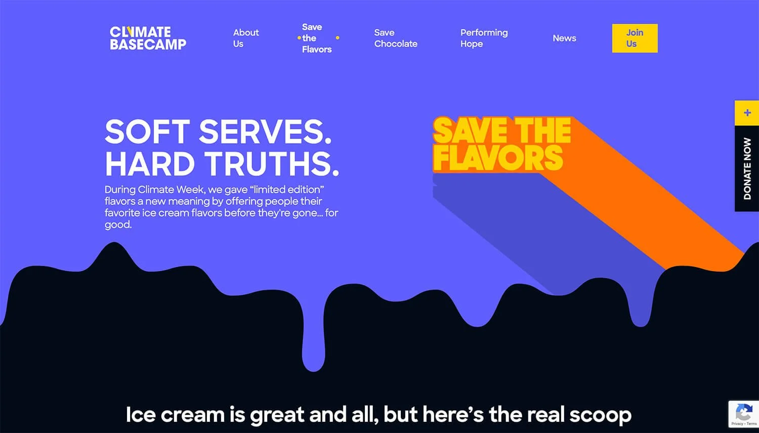
Climate Basecamp is a unique blend of scientific experts and social trendsetters. Using 5 pillars of culture: Food, Entertainment, Sports, Fashion, and Music – Climate Basecamp aims to get everybody talking about climate change. (source: climatebasecamp.org)
What I Like About This Website: Rails to Trails underwent a rebrand in 2024 and it’s been really fun to see the new brand unfold. I don’t always like videos above the fold on a website but I think it really helps tell the story in this case – trails are important no matter who you are or where you live. The bold and slightly playful typography stands out throughout the site and the “shades of green” color palette – while potentially risky from a variety and contrast standpoint – is well executed and does a nice job of popping off the page. Personally, I may have considered incorporating an orange or purple color into the brand’s palette, but every brand designer has their own reasons for doing things and I trust the mostly-green palette was intentional and strategic. I also like how the programs (TrailLink, Great American Rail-Trail, etc.) are listed above the navigation to save people from needing to navigate through the site to find the program they want to learn about.
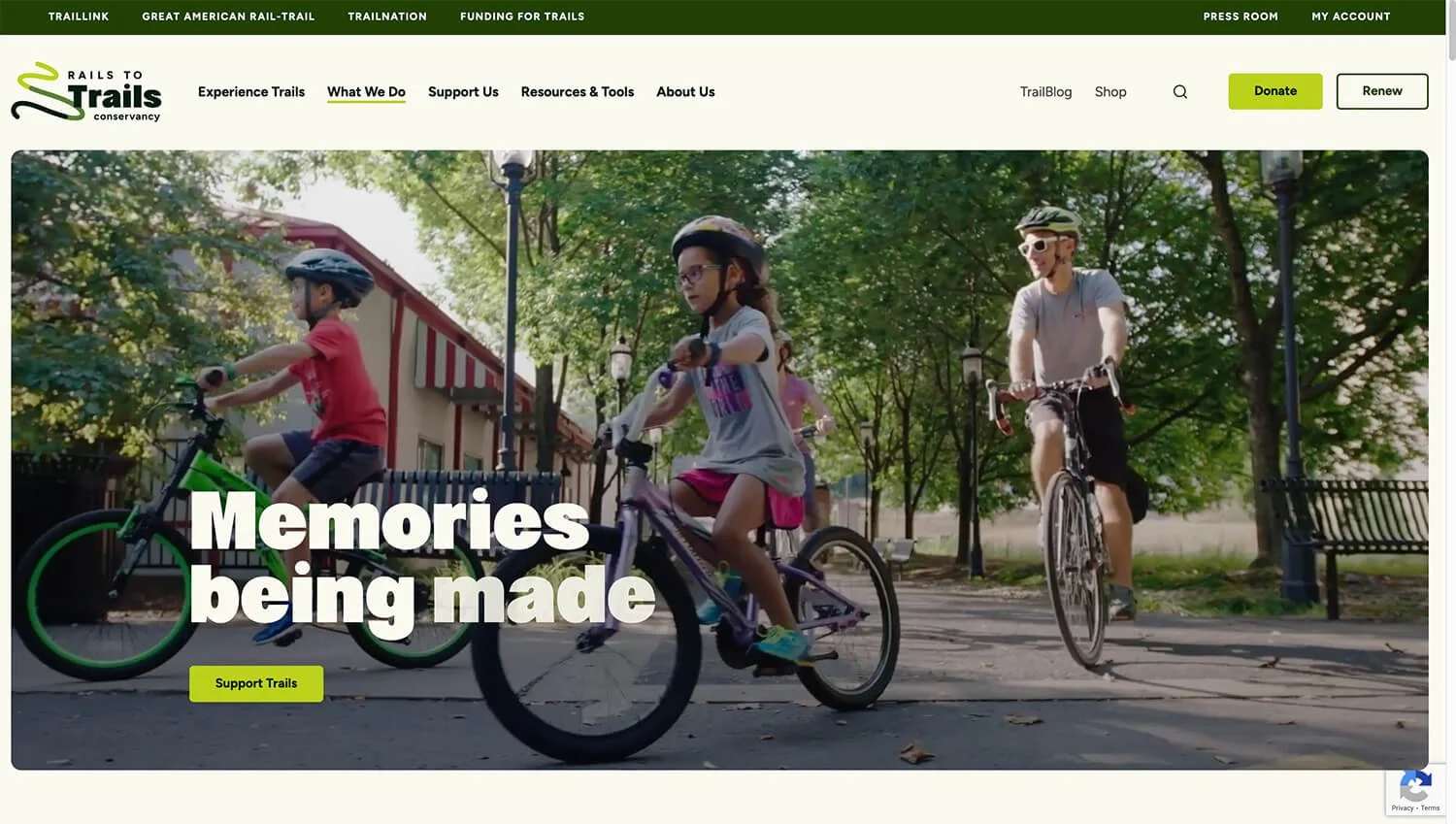
Rails to Trails works from coast to coast, supporting the development of thousands of miles of rail-trails and multiuse trails for millions of people to explore and enjoy. (source: railstotrails.org)
What I Like About This Website: The hero image (which can be clicked to play a video) makes you stop and think, the illustration overlaid on the photo does a really good job of telling the story of a child living in an urban environment dreaming about skiing. The bold, high contrast headlines with the animated underlines adds emphasis to important information in a fun, playful way. The “donate” tab along the side follows you wherever you are on the page so there’s no need to click around to figure out how to support the organization. I also love their “Why” page which is packed with data and visuals that support the org’s mission.
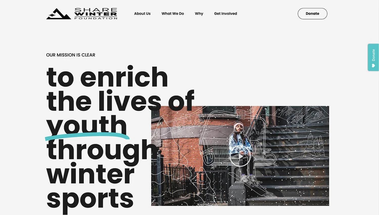
Share Winter strives to make winter sports accessible to a broader, more diverse community fueling the next generation of winter sports participants and enthusiasts. (source: sharewinter.org)
What I Like About This Website: The messaging and calls-to-action on the top fold of this site are strong, bold, clear, and concise. The first thing I notice on this page are the bright green “donate now” and “make a gift” buttons, there’s no question about where I need to go to give money to this organization. The high contrast text on the image is powerful and piques my interest about their mission. Creating a special edition logo or graphic for a big milestone – like they do here with the zero matching the O treatment in the logo – can be a fun way to celebrate your accomplishments and start the conversation about what’s next for your organization.
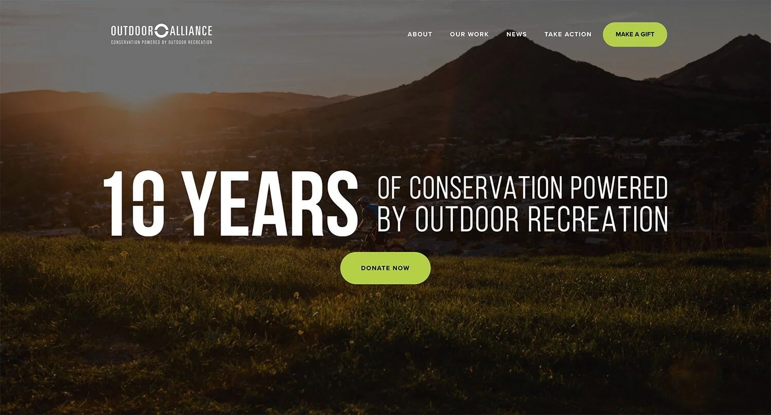
Outdoor Alliance is a nonprofit coalition of national advocacy organizations that unites the voices of outdoor enthusiasts to conserve public lands and ensure they are managed in a way that embraces the human-powered experience. (source: outdooralliance.org)
Great Outdoors Colorado (GOCO)
What I Like About This Website: The brand copy does a really nice job of telling the GOCO story and capturing the Colorado outdoor and recreation lifestyle and culture. Scroll down to just below the fold and we see the program stories – these are really nicely laid out and are far more engaging than a bulleted list or links on a page. One big thing that stands out to me are the icons in the dropdown menus in the navigation – I don’t think I would have had the courage to do this myself but I actually really love the way it’s been implemented here and I think it helps break up the menu items which might otherwise feel like a long, overwhelming list. From an accessibility standpoint, this site loses some points with me because I find it difficult to read the outlined text especially when it’s overlaid on a photo. There are also a few other areas that lack contrast which could be difficult for people with low vision to read.
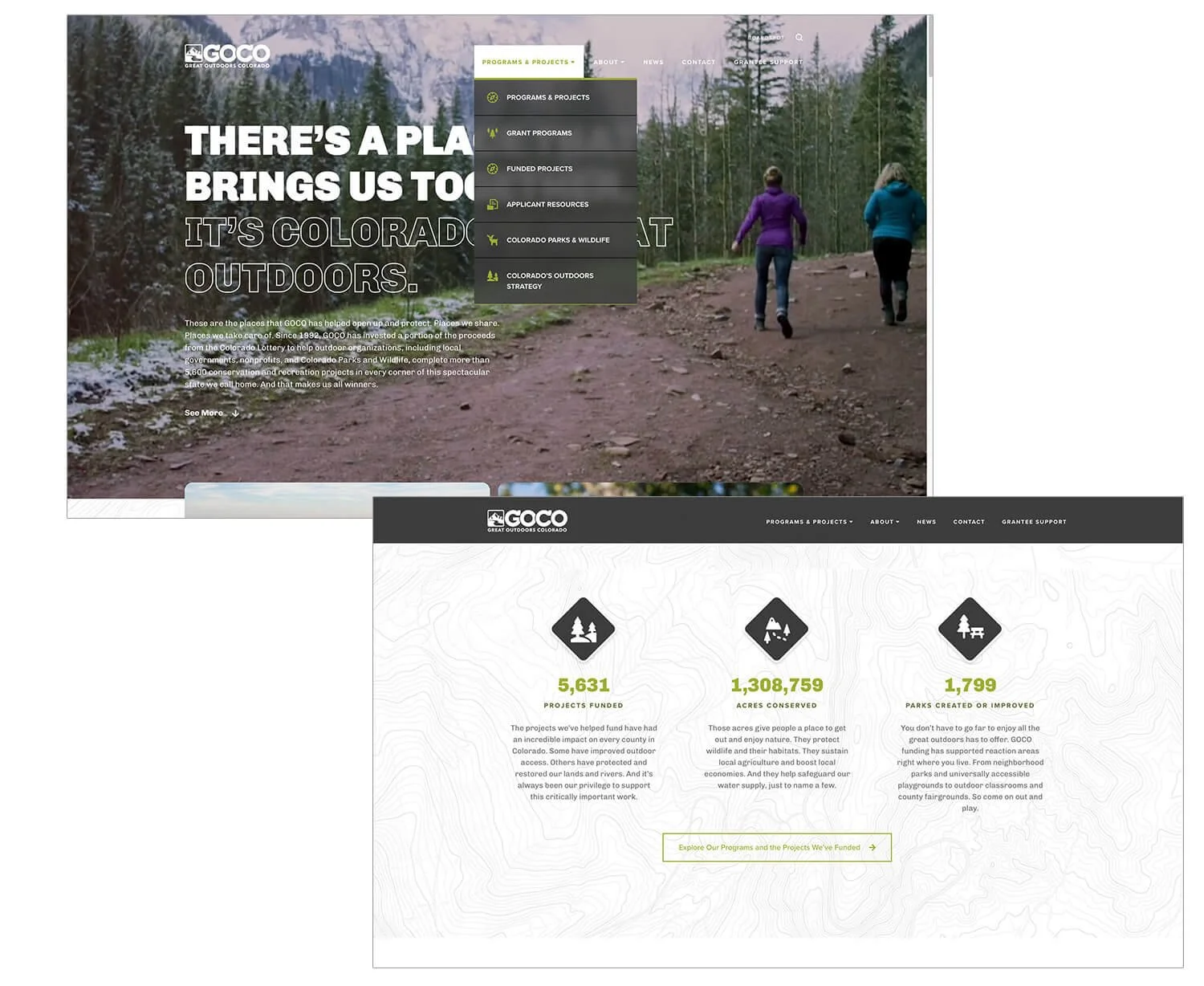
GOCO invests a portion of Colorado Lottery proceeds to help preserve and enhance the state’s parks, trails, wildlife, rivers, and open spaces. Created by voters, GOCO has committed more than $1.4 billion in Lottery proceeds to more than 5,600 projects in all 64 counties without a single dollar coming from taxpayers’ pockets. (from goco.org)
Detroiters Working for Environmental Justice
What I Like About This Website: The image on the homepage really drew me into this site – it collages together recognizable Detroit landmarks and elements with people and places from the community into one unique, colorful shape. I like the titles in the navigation – they tackle the who, what and why – the “What You Can Do” is an especially strong call-to-action because it goes beyond asking people to donate. Speaking of donations, notice the phone number at the top left that gives folks the option to text to donate. I’m starting to see this more and more, especially on flyers and printed materials and am curious if it makes sense to have it on a website since the “Donate” button is also right there. Everyone has different preferences for how they pay for things online, maybe it can’t hurt!
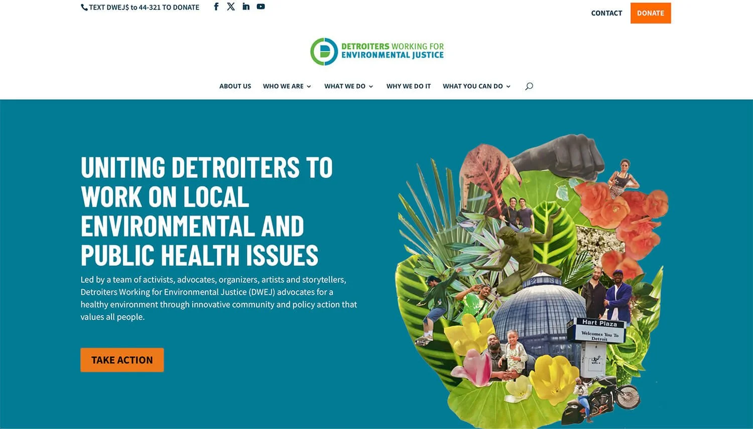
Detroiters Working for Environmental Justice (DWEJ) advocates for a healthy environment through innovative community and policy action that values all people. (source: detroitenvironmentaljustice.org)
What I Like About This Website: The first thing I notice on the homepage is the “Go Exploring” text with the little dancing arrow; it’s really intriguing and invites me to keep scrolling through the site. The subtle textured edges of the graphics helps give the site some extra personality. Their Get Outdoors page has a lot of great resources and maps to help folks find places to recreate and, of course, I love their One Bag Challenge because I’m a strong advocate of picking up litter. This is a small local coalition and they’ve done a nice job facilitating a lot of information and resources for their community in one place.
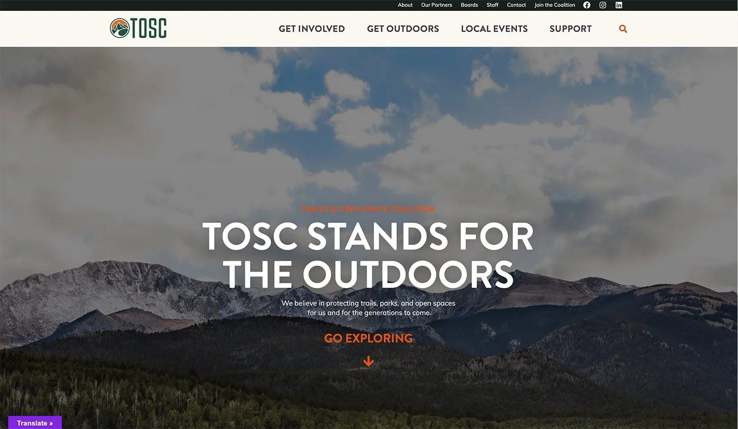
TOSC works cooperatively with local and regional governments, community organizations, businesses, families and individuals who share the vision of an interconnected network of trails, greenways and open space. (source: trailsandopenspaces.org)
What I Like About This Website: I LOVE this website. The photography and handmade nature elements make me feel what the organization is all about before even reading their mission statement. The satisfying flow of the graphic elements, content and photos makes me want to keep reading and see what else is on the site. The font is organic and playful but still easy-to-read and gives us the sense that the organization isn’t your rigid, run-of-the-mill environmental justice nonprofit, but one that’s run and supported by creative, compassionate people. I encourage you to spend a few minutes on this site and notice how it makes you feel ❤️🌎
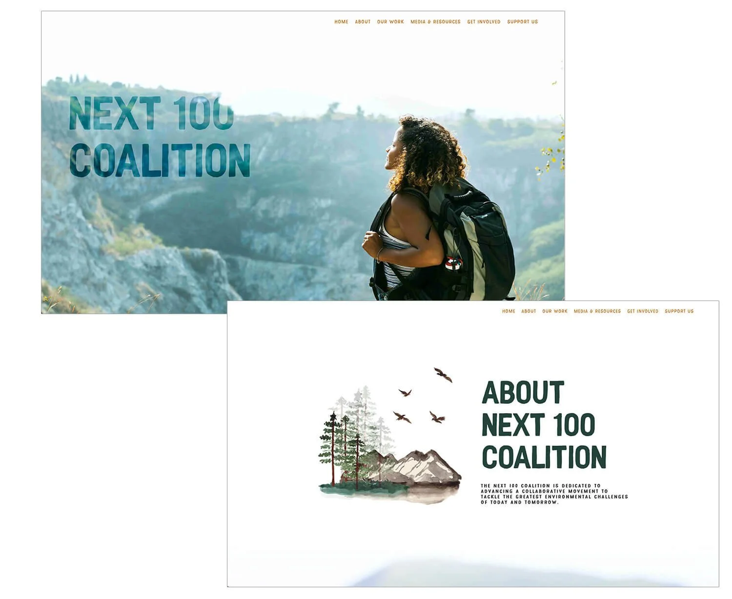
Next 100’s Mission is to connect, amplify, and support the leadership of historically marginalized communities in the administration, and stewardship of waterways, lands, ocean, and coasts to advance community prosperity and resilience. (source next100coalition.org)
I hope you found this list valuable and inspiring. Figuring out websites and branding can be hard stuff, but getting it all dialed is so worthwhile because it will help your organization stand out among the rest and make your cause memorable.
The designs and content featured in these examples are the sole property of their respective creators and authors. High Mountain Creative does not claim ownership to these website examples in any way.
I’m Margo! A graphic designer who works with conservation-minded nonprofits and brands on projects like logos & branding, annual reports, maps, and infographics. If your nonprofit is due for a brand refresh or logo redesign, I’m your gal! Visit my portfolio to see some of my work with other nonprofits and let’s schedule a call so I can learn more about your project.