Visit USA Parks Brand Refresh
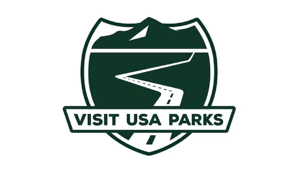
Old Visit USA Parks Logo
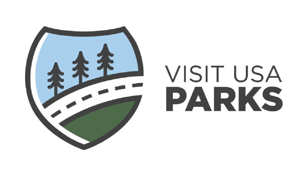
New Visit USA Parks Logo
Project Overview
Client:
Visit USA Parks
Herrmann Global
Location:
Lander, Wyoming, USA
Project:
Visit USA Parks Logo Refresh
Project URL:
Visit USA Parks Website
Project Details
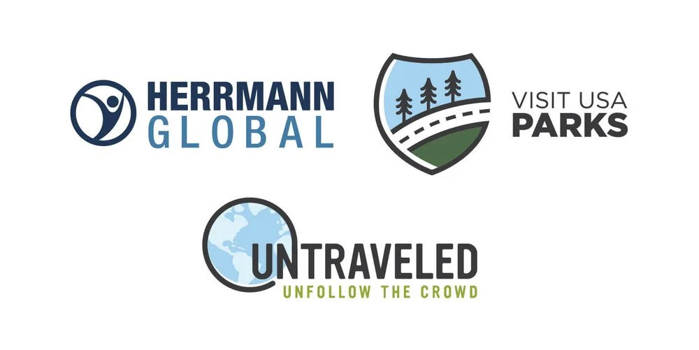
The Herrmann Global brand family. Visit USA Parks’s parent company, Herrmann Global, wanted to create a cohesive brand family alongside their other brand, Untraveled.
Background:
Visit USA Parks is a platform that connects road trippers with America’s best-kept secrets by crafting meaningful stories about small to midsize destinations.
Visit USA Parks was seeking a brand refresh because their original logo was too busy and difficult to read when scaled or read from a distance. Additionally, Visit USA Parks’s parent company, Herrmann Global, wanted to create a cohesive brand family alongside their other brand, Untraveled.
Challenge:
As with any brand refresh, it was important to give Visit USA Parks a new look while honoring the old brand in a way that still makes the brand recognizable and trustworthy to its audience. The client wanted to maintain the interstate highway badge shape, the road graphic and nature elements while staying away from the busy look and feel of their old logo.
Solution:
By moving the brand name outside the logo, the badge icon was able to stand alone and be recognizable across multiple applications at nearly any scale. Sampling the old Visit USA Parks brand colors and updating them with fonts from the Herrmann Global logo satisfied the need to create continuity across the brand family and maintain recognition from the old Visit USA Parks brand.
Impact:
This brand refresh gave Visit USA Parks the strong, professional visual presence it was missing before. Establishing a definite color palette, brand standards and set of design elements took the brand to the next level.
How this helps the planet:
Visit USA Parks and its parent company, Herrmann Global, promote sustainable travel and responsible tourism across their platforms. Having a strong brand increases the effectiveness and visibility of their cause and reach, educating more people about the impact their travel has on the land and people where they visit.
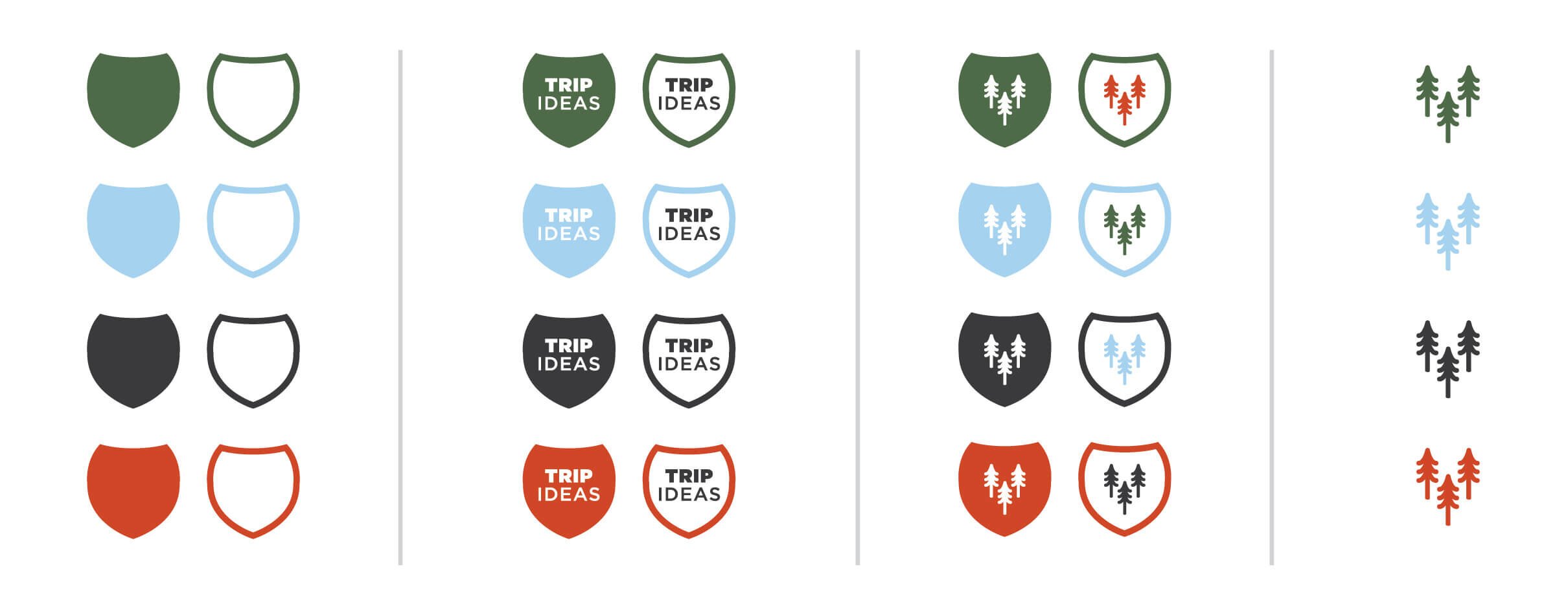
Visit USA Parks brand assets include a variety of badges including one that can have customized text.
We have been working with many designers, however Margo’s approach and passion for sustainable travel and creative design always has been sticking out. Her thought process and creative skills are excellent and our brands have grown significantly because of her creative strategy.
— Florian Herrmann, President, Herrmann Global & Visit USA Parks
