What Happens When You Design For Accessibility? 5 Informative Tips For Beginners

I’ll start by saying that I’m not an expert in accessibility, I’m here to share what I know as a beginner to help the next beginner learn from my mistakes. If there were a Designing for Accessibility 101, this would be the Cliff Notes of the course description. There are several different categories of accessible design but here, we’re going to go over some general advice for designing a PDF document for accessibility and Section 508 Compliance.
What is Accessible Design?
Accessible design helps make products and services available and usable to people with various disabilities. It spans across many disciplines of design– from architecture to websites. More than ever before, designers have a responsibility to understand how we can help others have a good experience while using something we’ve designed. Accessible graphic design generally focuses on document headings and structure, font & color choices, hyperlink treatments and appropriate image tagging.
5 Tips for the Next Beginner
I struggled a lot with my first accessible design project because it required me to rethink a lot of my design processes. I felt a lot of limitations to my usual creative thinking since accessible design prioritizes function and usability over aesthetics and a focus on visuals. There’s a whole invisible layer of design that needs to be considered for accessibility. This layer felt complex and overwhelming to me at first, but I’m working on making it a regular part of my design process.
I share a lot of resources throughout this article and want to give a huge thank you to all of the pioneers of accessible print & digital design for sharing this knowledge and providing this information to the community so that we can all work together to make design and visual communication more accessible to everyone.
Don’t Save it for the End: Start your project with accessibility in mind. Waiting until after the layout and design is finished can create a lot more work or end up costing you more money if you’re hiring someone to remediate your final PDF. Lay the groundwork by having a general understanding of how to design for accessibility and how someone with a disability might experience your final design. Some of the following tips will help you with that – but be sure to check out the resources in the last section from the real experts.
Start Small & Easy: Choose a short 2-3 page document for your first accessibility project. Try to avoid documents with elements that require a more complex understanding of tagging and structure – like tables, charts and forms.
Know the Basics: Some things you’ll want to know for designing for accessibility.
Document Structure: Proper headings and subheadings (H1, H2, H3, etc.) have to be used to create structure throughout the document. Not only does this help keep consistent hierarchy throughout the document for easy reader navigation, it helps a screen reader decipher reading order and properly dictate the document for a visually impaired person. UNC has a great quick explainer for Accessible Headings.
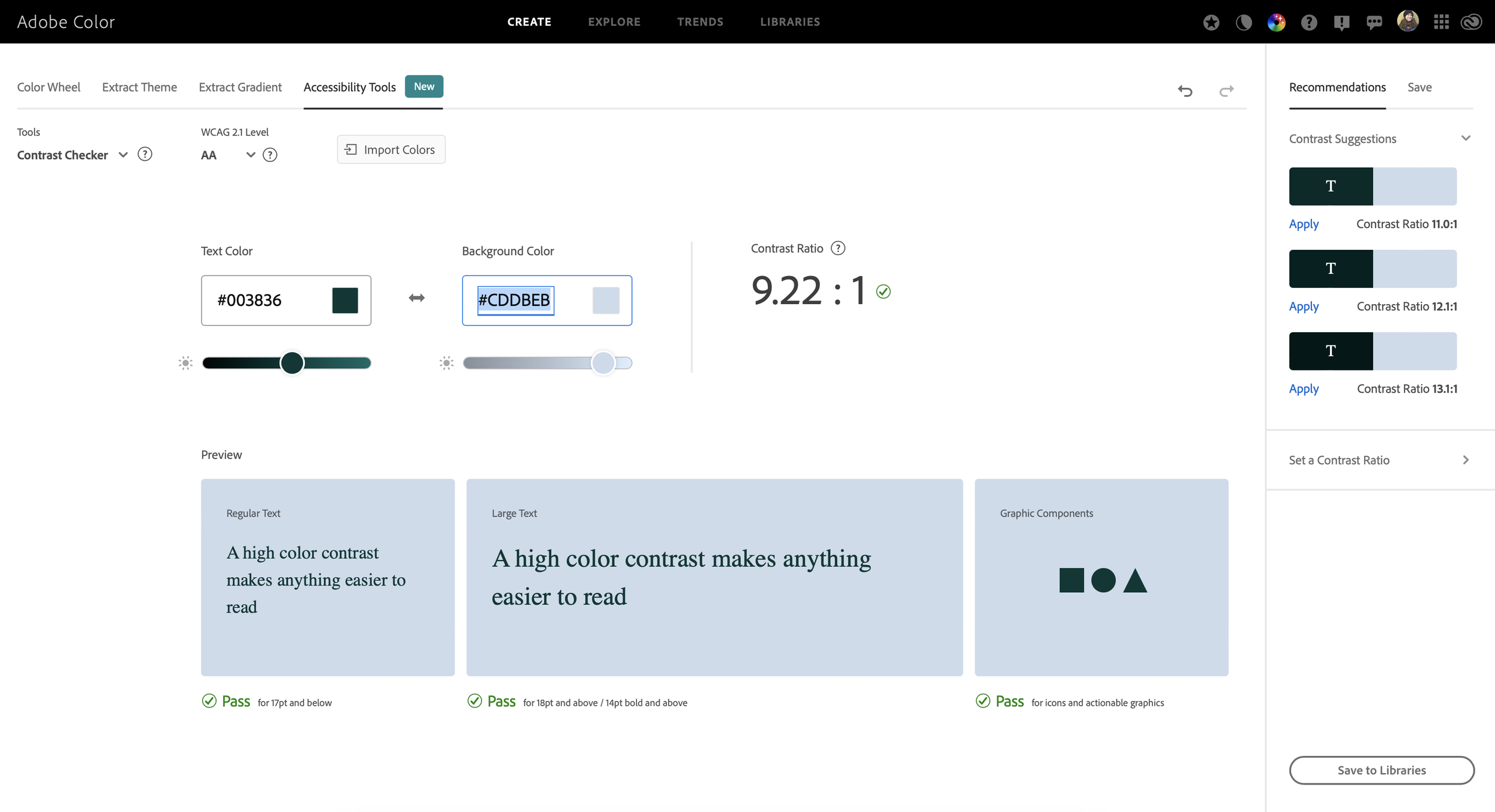
Color Contrast: Use a color checker tool like Adobe Color to make sure any fonts or graphics using multiple colors or reverse (light on dark) treatments are still able to be seen by a color blind or visually impaired person.
Fonts: Select fonts that are easy-to-read. Avoid script fonts.
Alt Text: This is the description linked to a photo that provides context about the image for a screen reader to read aloud.
Keep Your Document Clean & Simple: Avoid using any unnecessary paragraph breaks, blocks of color, glyphs, images or graphics. Everything in a document needs to be tagged as text, an image or an artifact (essentially a purely decorative element) so that it can be recognized by a screen reader and properly dictated to a visually impaired person using the document.
PDF Remediation: This is the process of checking a document for accessibility based on several different criteria and industry standards.
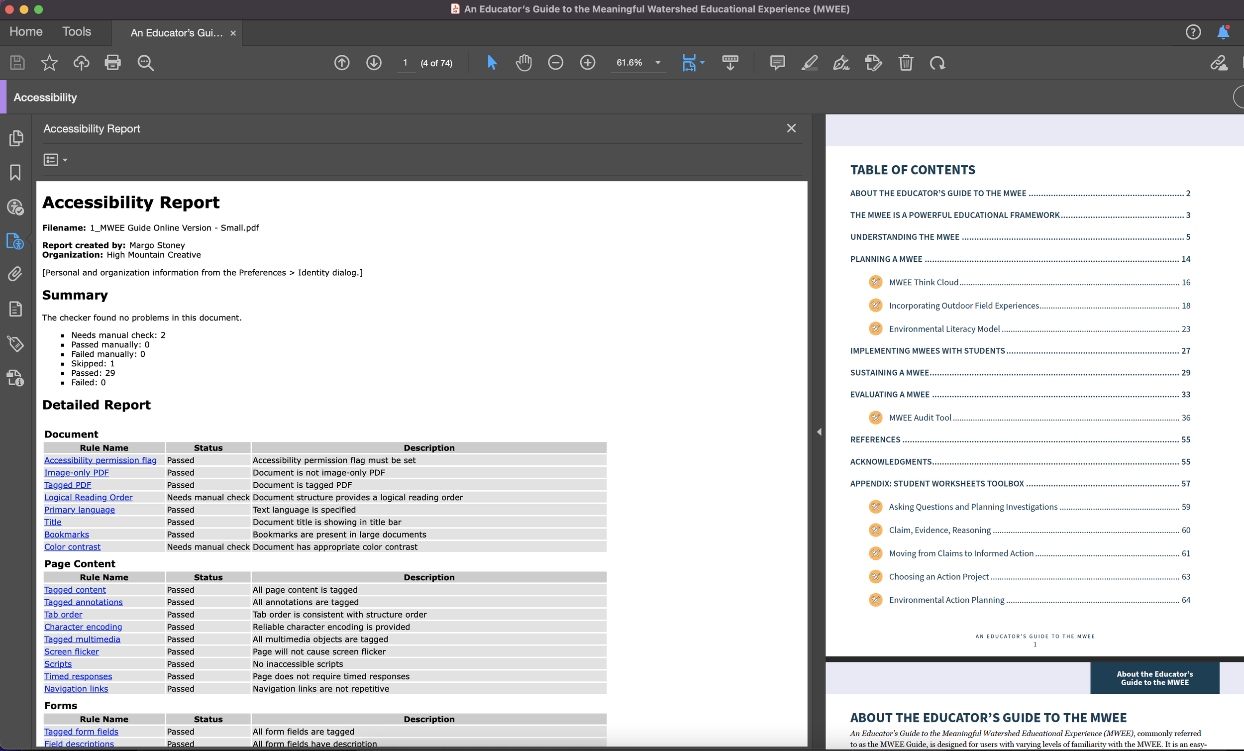
4. Test, Fix, Repeat: You can use Adobe Acrobat Pro’s Accessibility Checker to run a report on your PDF to see if it passes as accessible or if errors need to be fixed. When Adobe finds an error, it helps you troubleshoot a solution. So that’s nice.
5. Ask for Help: I needed a lot of help on my first project, and I mean, a lot. There are loads of great free and paid resources to help you understand designing for accessibility. I tend to learn best with 1:1 interaction, so I paid for a consultation with accessibility experts Dax at Chax Consulting, but I also learned a lot from YouTube, blogs and other designers. Here’s a list of helpful resources, groups and people that I’m constantly learning from:
PDF Accessibility Facebook Group - Join by request
CHAX Consulting - Accessibility Unraveled - Podcast, trainings, consulting
WebAIM’s Creating Accessible Documents (This is for MS Word but most of the information is relevant for any accessibility project)
Designing for accessibility changed the way I think about design. It’s an excellent reminder that design isn’t meant to just look good, it must also be functional. I started to consider things like: how does this document look to a color blind, visually impaired person or someone with a disability? And, how will assistive technology – like a screen reader – navigate through this document to aid someone who is blind, visually impaired or has a learning disability? Just some food for thought as you begin your accessibility journey. Thanks for reading and good luck with your first accessible design project!
—
My name is Margo and I’m a graphic designer who works with conservation-minded nonprofits and brands on projects like logos & branding, annual reports, maps, and infographics. I work with my clients to create beautiful and meaningful design that amplifies the marketing efforts it takes to ignite action and change. If you need help getting started on your next project to save the planet, let’s set up a time to chat.