5 Environmental Nonprofits with Good Branding
A good logo and well-thought-out brand identity will get your environmental nonprofit noticed, improving your visibility and broadening your impact.
Good branding makes a cause memorable, easy to understand and relate to and builds trust amongst supporters. It’s not just a well-designed logo that makes an effective brand, it’s the color palette, execution of marketing and donor materials and digital assets, its timelessness.
Here are some nonprofits that have been memorable to me because of their good branding.
© Grand Canyon Trust
1. Grand Canyon Trust
GCT really nailed the color palette. Even if you look at their website or marketing materials without seeing the logo or organization name, you get a sense of the Grand Canyon – the landforms, the red sandstone, the river.
© League to Save Lake Tahoe
2. The League to Save Lake Tahoe aka Keep Tahoe Blue
No matter where you live in the United States, you’ve probably seen a “Keep Tahoe Blue” bumper sticker on a car (guilty, I have one). There really isn’t anything groundbreaking about the design itself, it’s the shape of Lake Tahoe with the words in Helvetica font. The simplicity and bluntness of the cause are what have made this design so viral and iconic.
© WWF
3. World Wildlife Fund (WWF)
This brand has stood the test of time. WWF has been around since 1961 and has some of the most recognizable branding amongst non-government organizations around the world. While minor updates have been made, the WWF logo has essentially stayed true to its original design. Check out this cool archive celebrating WWF’s 50th anniversary: WWF History
© World Wildlife Fund
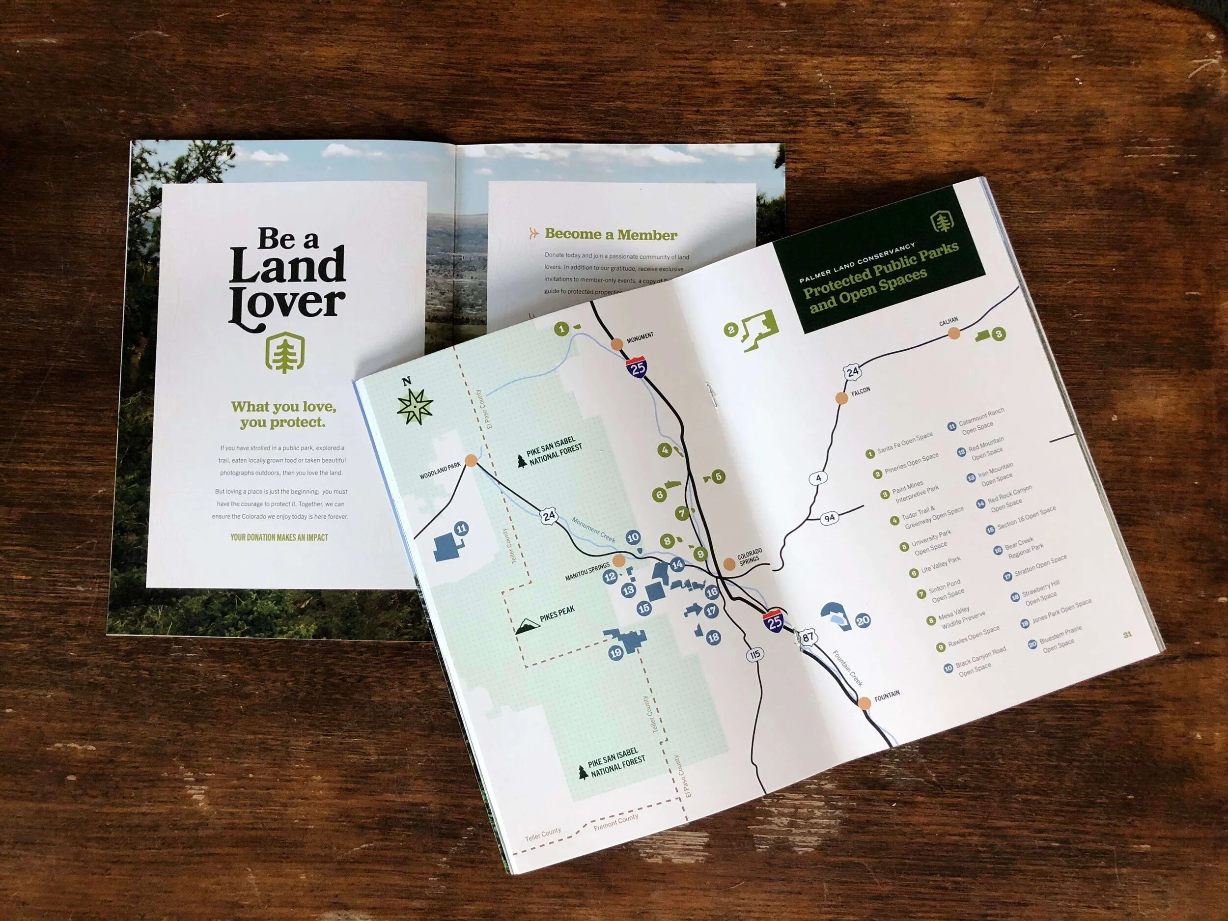
© Palmer Land Conservancy
Design © Palmer Land Conservancy
4. Palmer Land Conservancy
Palmer is a former client and I was delighted to see their rebrand in 2020. Their logo went from “stuffy and blah” to “fun and adventurous” clearly equipping themselves to tap into the next generation of donors and supporters. What really stood out to me, were the donor materials I received in the mail including a field guide highlighting the spaces protected by the conservancy.
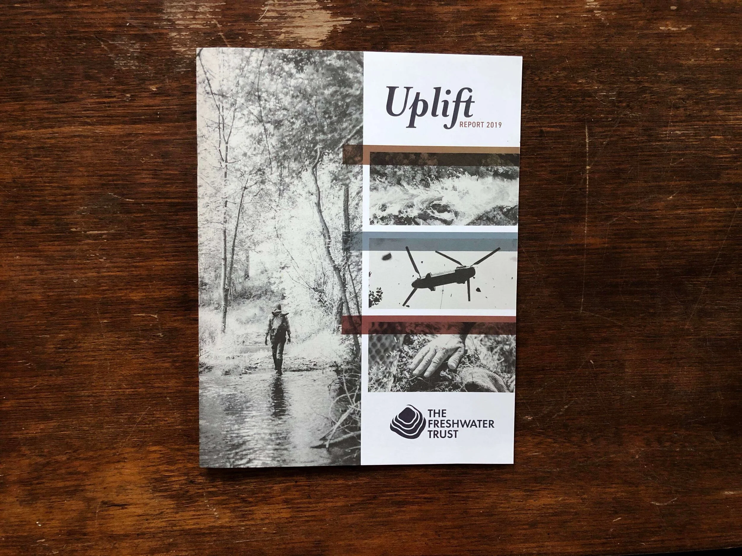
© The Freshwater Trust
5. Freshwater Trust
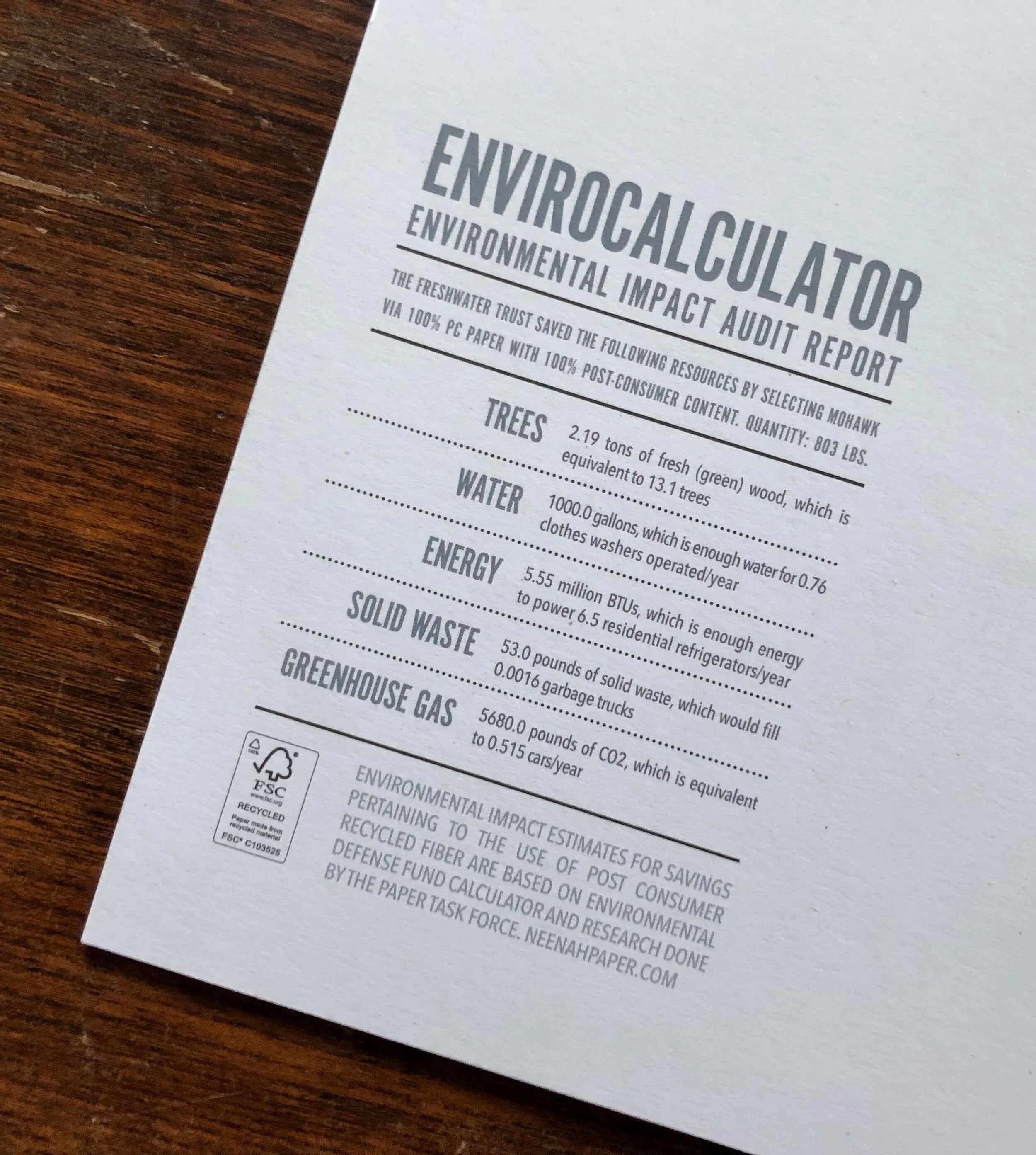
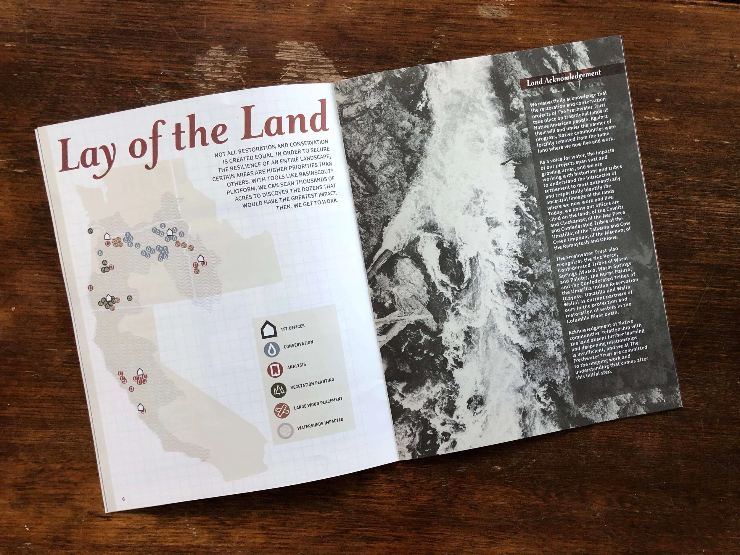
Freshwater Trust’s logo and digital assets are nice, but it wasn’t until I received their printed “Uplift Report” that they truly made an impact on me. The report used 100% recycled paper with 100% Post-Consumer content and included an environmental impact audit report on the back page with stats on how the paper choice conserved multiple resources. The limited color palette and clean design made the report save-worthy and memorable.
Designs © The Freshwater Trust
Designs © The Freshwater Trust
Designs © The Freshwater Trust
What do you think? Comment below with your favorite nonprofit branding!
Note from Margo: I did not design these logos and have little or no affiliation with these groups.
