Tips for Designing Infographics for Small Businesses and Nonprofits
How to Design an Infographic
Attention spans are getting shorter and the demand is increasing for infographics, data visualization and simplified content. The primary purpose of an infographic is to simplify large amounts of information into a digestible visual for an audience to process at a glance.
Infographics are great for nonprofits and mission-driven brands to use to tell a story about the good they’re doing. I’m happy to share some tips for creating your own infographic.
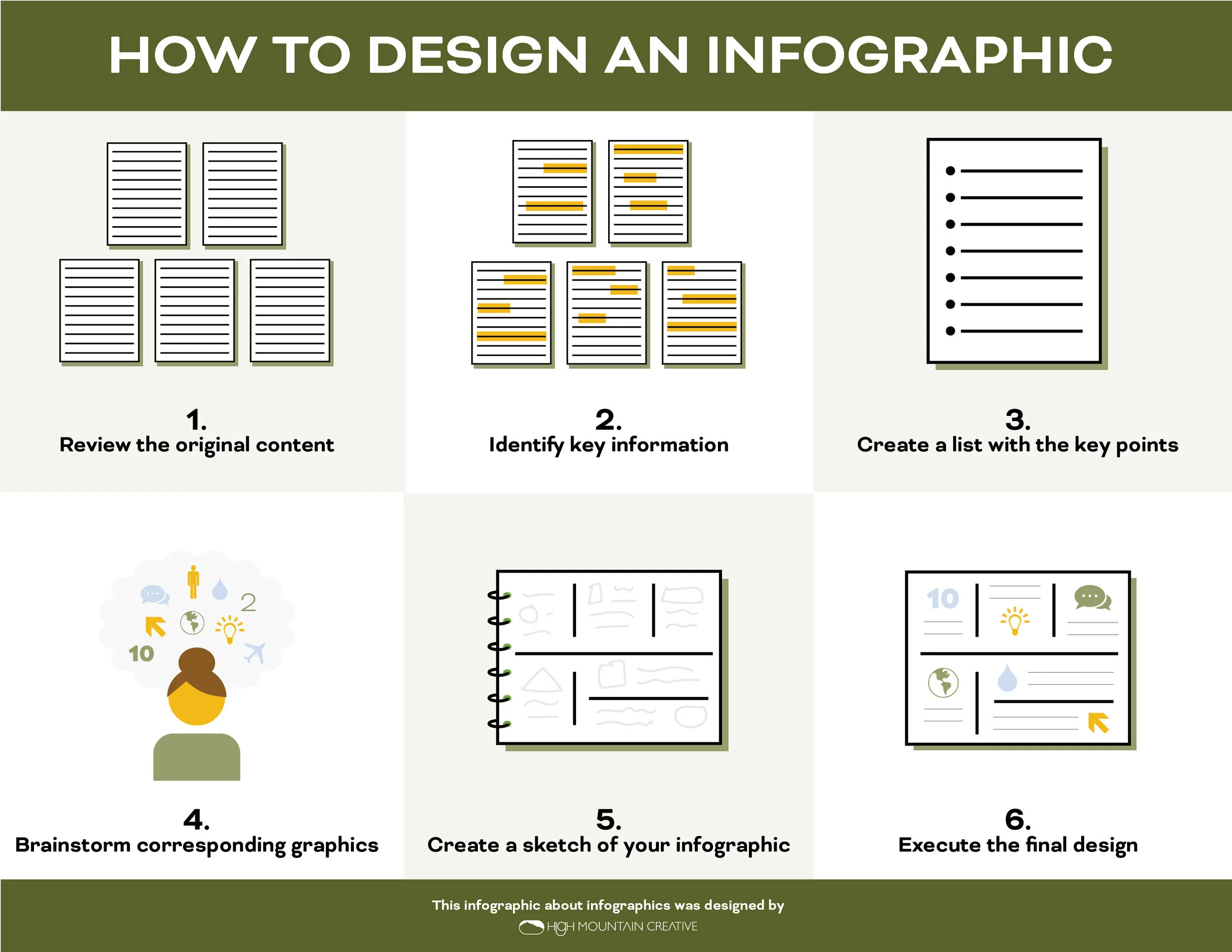
1. Review your content, check for clarity
The infographic process typically starts by reviewing several pages worth of copy that need to be distilled into a simple visual with key points. When we spend a lot of time immersed in a subject we’re writing about, it can be easy to lose perspective on what the topic might sound like to an outsider. This is especially true when the subject matter is specific to your cause or business. Take a minute to read through your document with a beginner’s mindset or ask someone outside of subject to review it for you. Here are some things to consider:
How will someone no knowledge of this topic digest this information?
Does my content include words or phrases that are not commonly known outside of my industry or organization?
How can I simplify complex ideas or themes?
2. Identify key information for your infographic
It can be a challenge to pare down content from several pages into a handful of key points, which is why it’s helpful to reread your document with an ever wider lens. Think of this stage as using a net that only catches the really big ideas and most important information.
Highlight any nuggets that will help your audience understand the big picture.
Look for numbers, stats and data points that are easy to visualize.
Highlight facts, locations, accomplishments.
If you read a tidbit and a cool visual comes to mind, highlight it.
Paring down and wordsmithing copy helps simplify messaging and gives the visual elements space to do their job.
3. Create a list of key points
With everything you highlighted that made it into the net, create a bulleted list – each bullet point will become a visual or key point on your infographic. Work on paring down the content and wordsmithing your bullet points to make them shorter and as concise as possible. Try to get each bullet point down to 6-8 words – the shorter the statement, the easier it is to make an effective visual. It’s important that the bullet points remain accurate throughout this paring-down process, so this is a good time to cross reference your original copy and run your key points by any team members to check for clarity.
For a standard-sized infographic (8.5”x11” printed or above the fold size on a website), I typically try to keep the number of bullet points to 7-9.
4. Brainstorm visuals to accompany your infographic
Study your key points and think about icons, visuals or illustrations that could go with each one. You can use a Google image search or Pinterest to get inspiration and ideas for what to use for your icons. Try to come up with a list of 4-5 possible visual ideas for each bullet point on your infographic. While it’s important to prioritize graphics or icons that are easily recognizable and translate well to your subject matter, it’s also important to make your designs unique and true to your brand. At this stage, it’s important to reference your brand styleguide, this will help you decide how simple or complex the visuals for the infographic should be. If you have limited design capabilities or resources, sites like Shutterstock and Creative Market have ready-made icon sets for purchase.
5. Create a sketch of your infographic
Get ready to start solving the infographic puzzle! This can be the most labor-intensive part of the infographic design process but it’s also the most fun because it involves a ton of play. Imagine this phase as though you’re solving a crossword puzzle – I recommend using a pencil and sketchpad or drawing tablet to allow for a lot of rearranging and reorganizing.
Sketch out the overall flow of the infographic including space for the headline and footer (I typically put the call-to-action or URL here).
Pencil in where you want each key point to live on the infographic.
Experiment with different words being larger or smaller, play with stacked and horizontal orientation for each key point. Try out different visuals for a key point if something isn’t fitting.
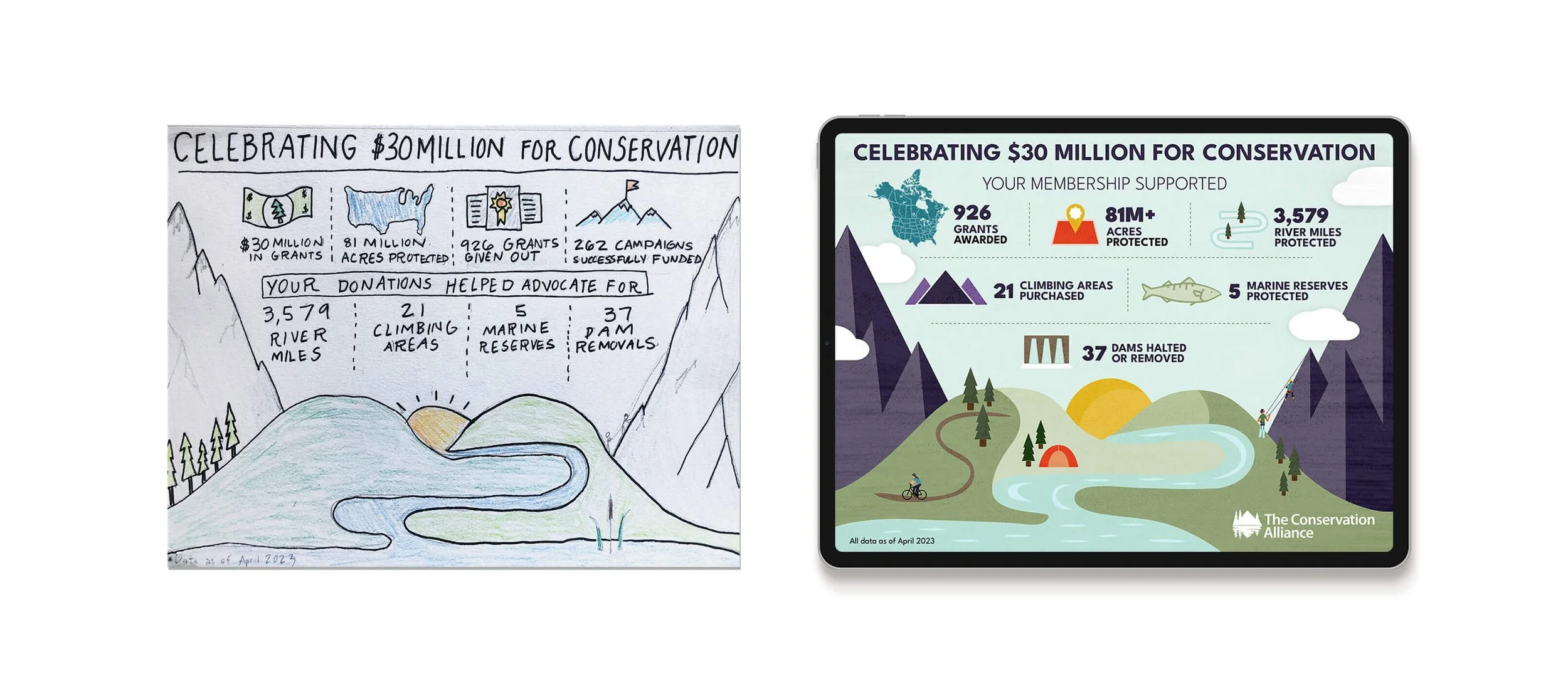
Sketching out your infographic helps you get an idea of flow, spacing, sizing and orientation. It’s also a good way to map out if you need to trim the amount of key points or graphics. You can use a pencil and paper or a digital drawing tablet.
6. Execute the final design
Once you have your infographic sketch nailed down, use the graphic design program of your choice to produce the infographic design. I always use Adobe Illustrator because it’s easy to move, resize and color the pieces of the infographic. Free alternatives like Canva can be really useful, too. Prep your document by choosing your color palette and fonts then copy and paste the bullet points into your document for easy access. Have your sketch in front of you for easy reference.
Using data and illustration to communicate information about a campaign, research or idea makes it easy for an audience to digest and understand a topic at a glance. In this example, the infographic breaks down the benefits of restoring the Mississippi River Gorge can have on river flow, wildlife and recreation.
As you may have guessed by now, designing effective infographics requires a lot of time, patience and attention detail, but the reward of having a powerful visual to help tell your story is so worth it!
I’m Margo! A graphic designer who works with environmental nonprofits and mission-driven brands on projects like logos & branding, annual reports, maps, and infographics. I work with my clients to create beautiful and meaningful design that amplifies the marketing efforts it takes to ignite action and change. Visit my portfolio to see some of the projects I’ve collaborated on with nonprofits to protect the environment.


