Does Typography Exist in Japan?
Every time I travel somewhere new, I start a photo collection of unique signs and letters. I have never traveled to an Asian country before. Last month, when I arrived in Tokyo, my mind was blown with the question of: does typography exist in Kanji, Hiragana and Katakana the way it does with our letters? I felt dumbfounded, but I guess it didn't occur to me until I was surrounded by it. With latin letters, we have a choice of fonts; script, serif, sans serif. There's X-height (the height of the lower-case letters of a font), ascenders and descenders (the bottom of a y or the top of a t), shoulders (the thing hanging off the r). What is the Japanese equivalent?
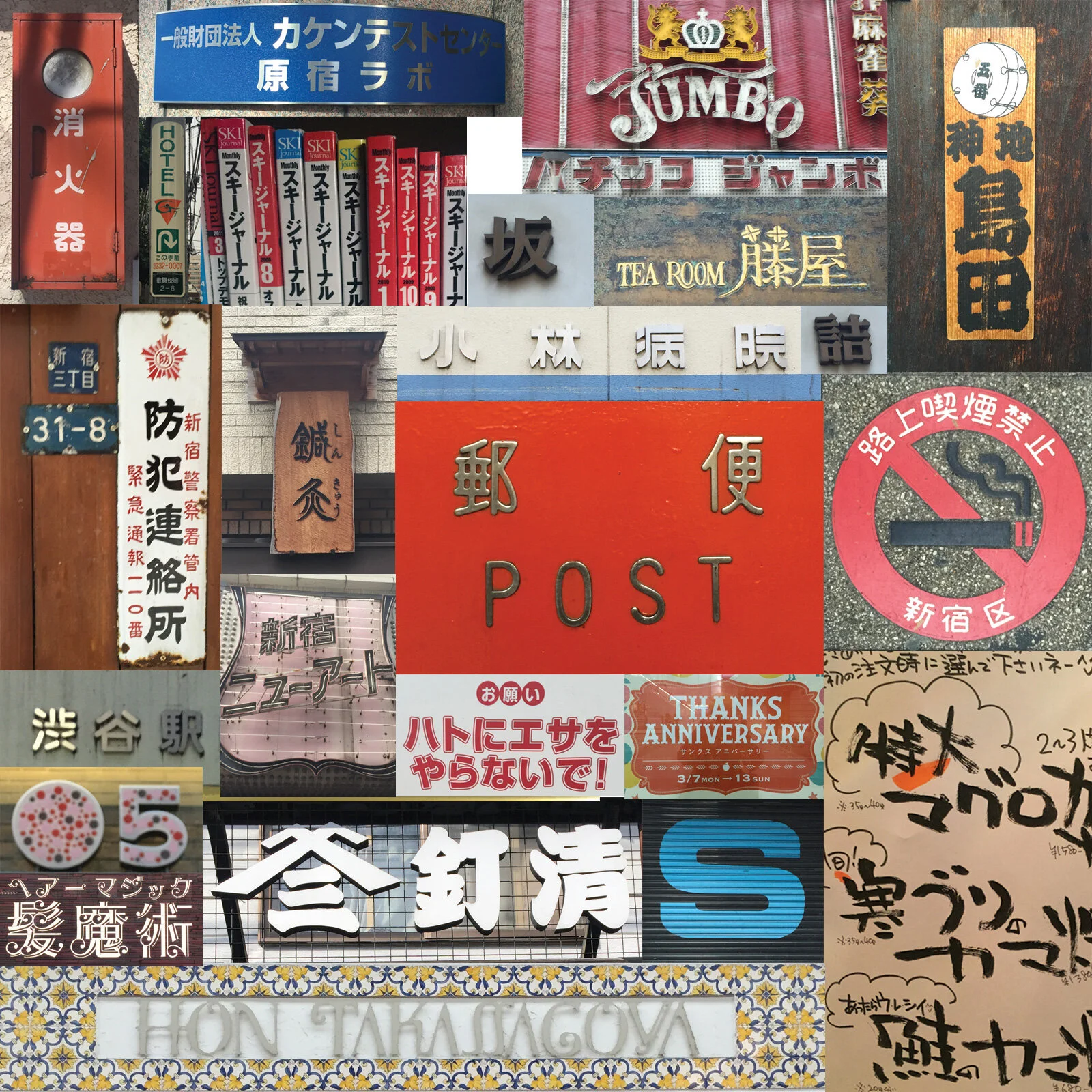
As I started observing and taking photos, I found myself noticing characters that were neat and tidy while others showed variation in thickness. Narrow characters, fat, bulky ones. I found a few very stylized and artistic looking characters. This all sounds familiar, right? In a way, I (somewhat) answered my own question. Take a look at some of the examples in the image below and you'll be able to see for yourself.
I didn't find much out there when I was doing my post-trip research. I read this blog, which was very helpful in helping identify different font styles - explaining Mincho, Gothic, Maru and Kaku styles- but it left me wanting to know more. It's a whole new world of typography and design that is completely undiscovered for me.
Anyone know a Japanese graphic designer?

