12 Environmental Nonprofits with Unique and Engaging Websites
Find inspiration to boost your impact with these noteworthy nonprofit websites.
If you’re looking for website inspiration or just want to peruse and see what other environmental nonprofits are doing, you’re in the right place. I recently reviewed over 100 websites – everything from land trusts to wildlife conservation organizations – searching for ones that had elements that stood out and pulled me in. I considered things like logos & branding, graphics and iconography, calls to action, photos or videos and unique engaging content (like a hero image that plays rainforest sounds!)
Check out these neat examples:
They have a powerful logo and a bright, high contrast color palette which carries over well throughout the website. There’s a good balance of high-quality photography, graphic elements and white space throughout their website. The bold font used for the headlines makes it easy to navigate through the different sections of each page.

American Forests is a non-profit conservation organization, established in 1875, and dedicated to protecting and restoring healthy forest ecosystems.
The color palette is unique and breaks the boundaries of your typical “forestry” color palette. The iconography and the way they carry it out throughout the site is clever, especially in the footer. This organization has a lot of cool tools and resources to share and they went the extra mile to make a website that is easy-to-navigate, engaging and not overly “science-y” – which is extra impressive considering this project is part of the U.S. Forest Service and government websites are notoriously boring (sorry). I do want to note that, while I didn’t do a manual check, some of the color combinations on the website may not be color contrast accessible.
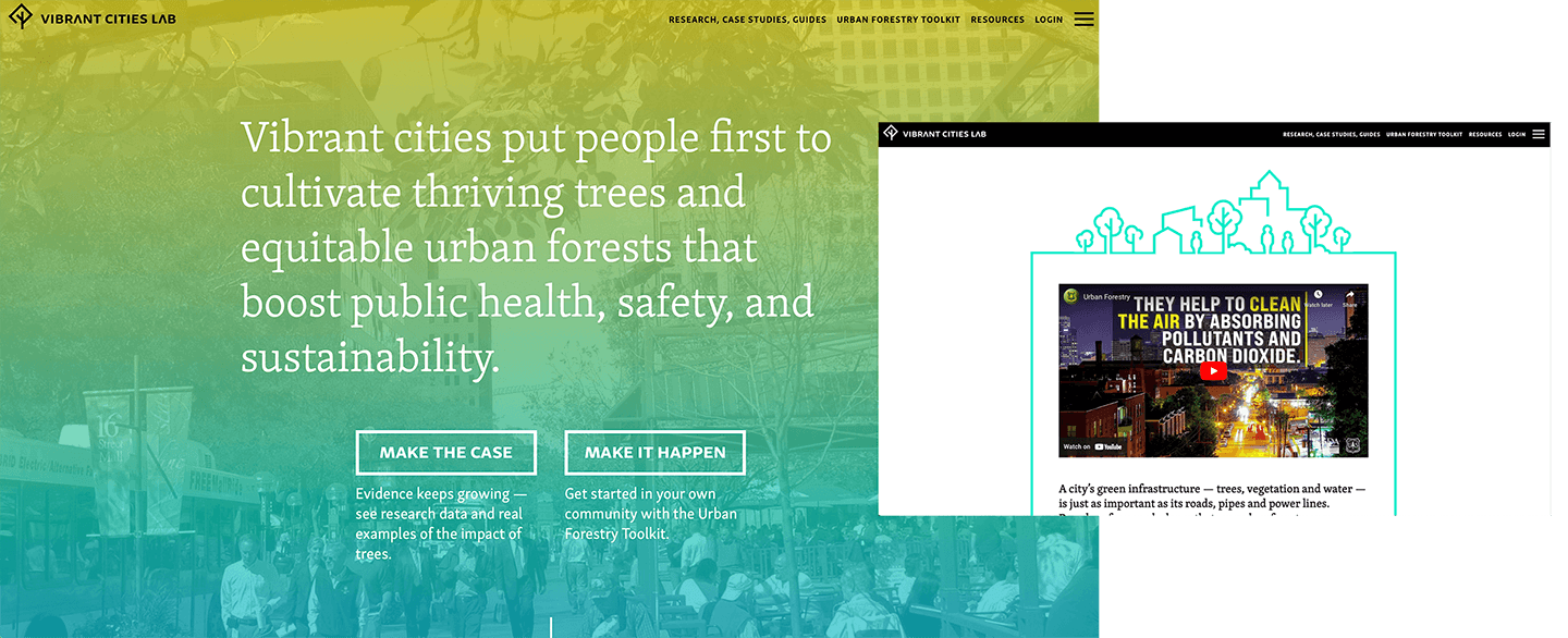
Vibrant Cities Lab is a joint project of the U.S. Forest Service, American Forests and the National Association of Regional Councils, merging the latest research with best practices for implementing green infrastructure projects in your community.
This website balances simplicity and straightforwardness with some understated creative elements like textures, organic shapes and unique photo treatments. The color palette is more muted but works well the way it's used minimally throughout the site.
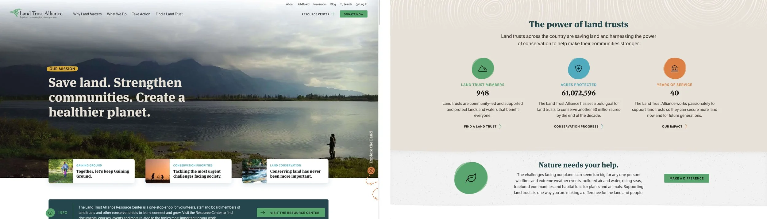
The Land Trust Alliance Resource Center is a one-stop-shop for volunteers, staff and board members of land trusts and other conservationists to learn, connect and grow.
The strong photography and bright color palette easily pulls me in. The mission, call-to-action and ways to donate front and center. The website isn’t too text-heavy, which makes it easy to skim and understand without getting overwhelmed by long blocks of text.
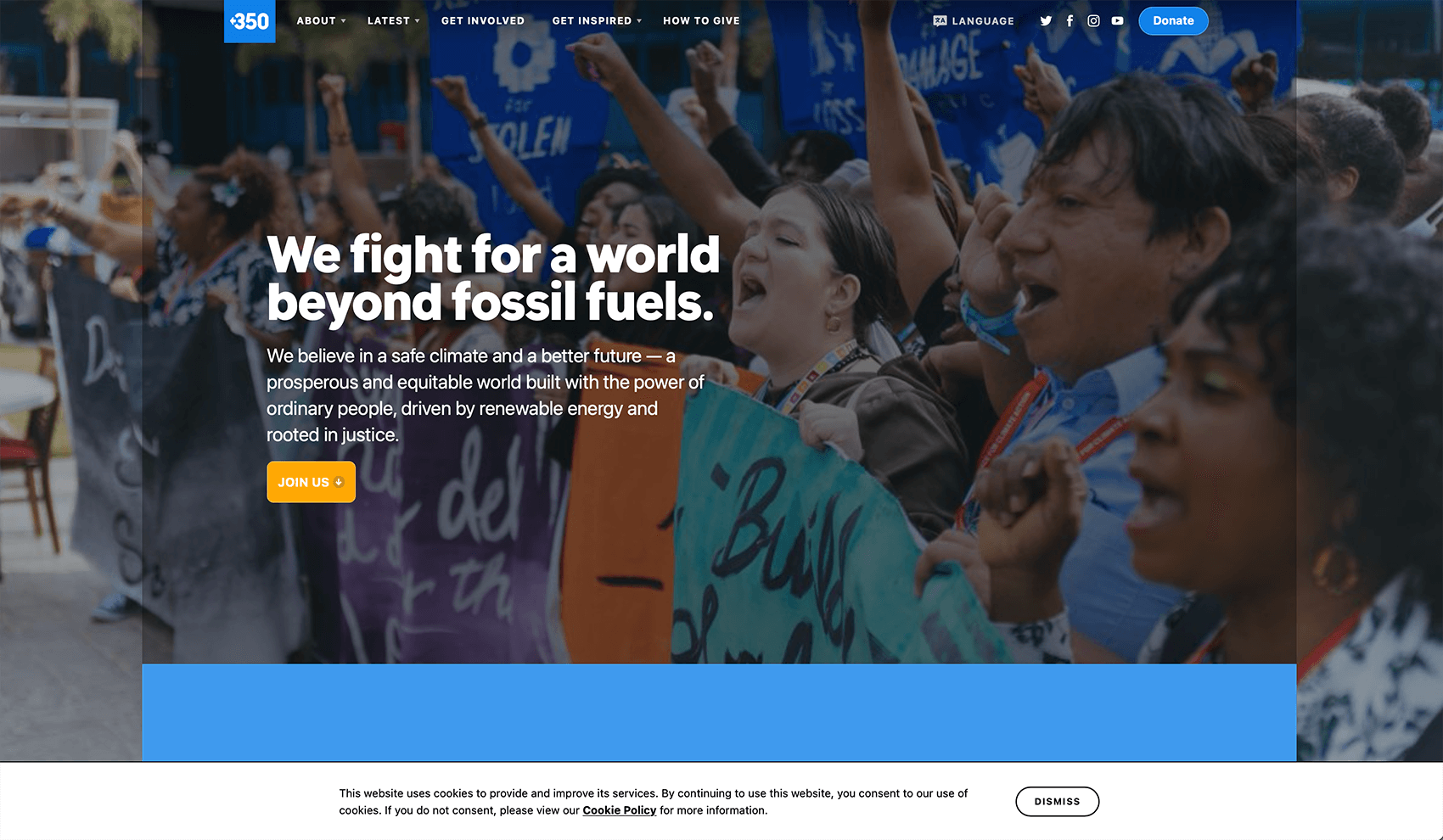
350.org an international movement of ordinary people working to end the age of fossil fuels and build a world of community-centered renewable energy for all.
The little arrow and the drop cap and font of the “O” stood out to me immediately and made me want to keep reading. The leaf-bridge logo is simple and brilliant and extremely clever. There’s a unique abstract texture-type graphic that is used throughout on callout boxes and pull quotes. It’s a simple element but it’s just enough to add a unique twist to the site.
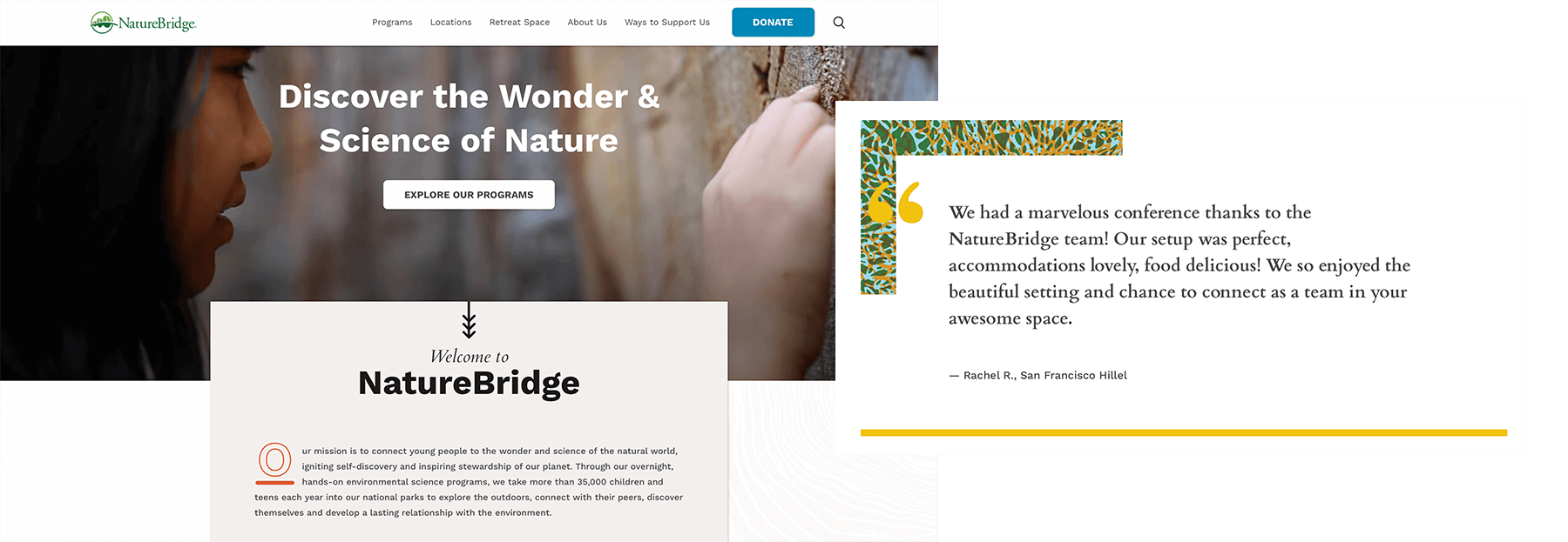
Nature Bridge connects young people to the wonder and science of the natural world, igniting self-discovery and inspiring stewardship of our planet.
I’ll start by saying that the style of this one may not be for everyone but you can’t deny that the design is different and unexpected! If you’re familiar with my work, you know that I love textures and a mixed-media look so naturally, this site stands out to me. The organic edges and watercolors are playful and make you feel like you’re in art class. It’s abundantly clear that play, children and nature are their main focus and that they’re serious, but not too serious to have fun.
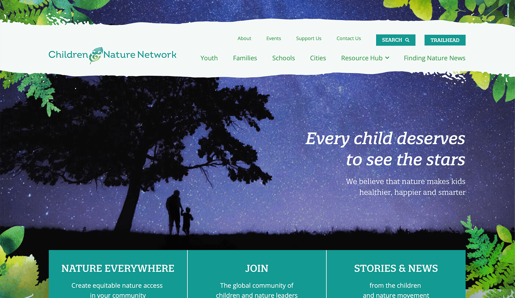
Children & Nature Network’s mission is to increase equitable access to nature so that children–and the natural world–can thrive.
This is a simple, well-balanced website. The home page has an interesting dynamic hero image that pans inside of a silhouetted image – yesterday it was trees, today it was cows. This treatment may not work well in all cases, but I think with the right shape and photographs, it’s an effective way to add some visual interest.
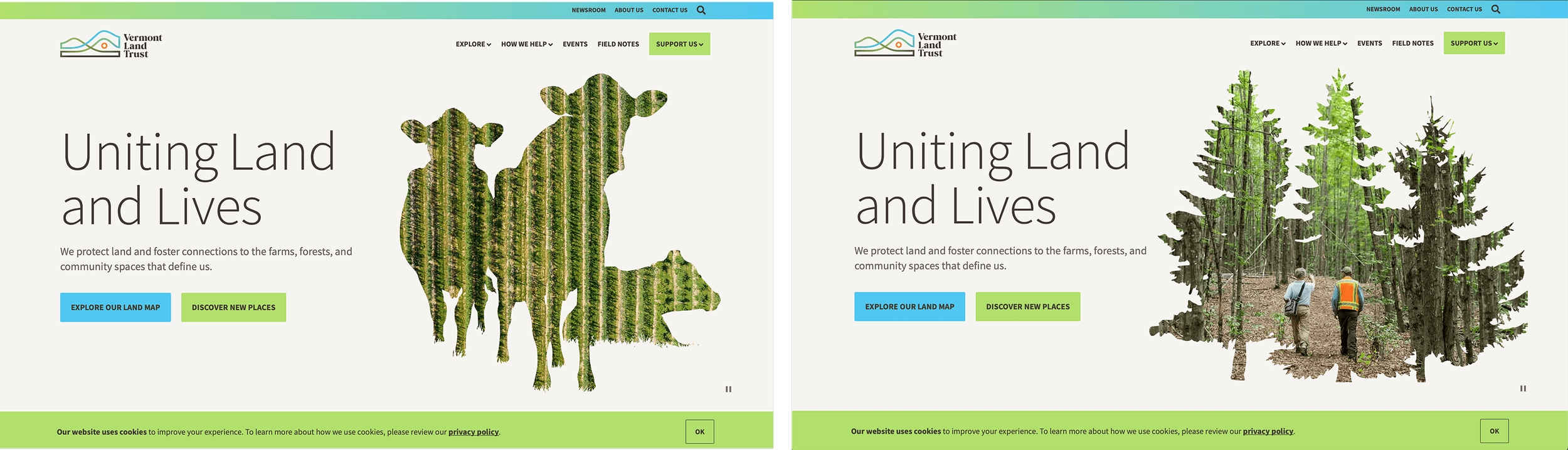
Vermont Land Trust works to conserve productive, recreational, and scenic lands which give the state and its communities their rural character.
The logo is just fun and memorable, yet there’s nothing complex or groundbreaking about the design. The shape of the “O” in the logo gets carried out in different elements throughout the site, this is a fine example of how a good logo helps solidify a brand’s visual language. The (very) bright color palette – neon green, pink and purple – is a bold move but, love it or hate it, it does make everything stand out and they all pass for color contrast for accessibility, so that’s a bonus!

Cool Earth exists to back people living in rainforest and fight the climate crisis.
This website is really powerful, yet so simple. The logo is timeless and translates well on the site. The white navigation bar has a subtle wave that mimics the sway of the ocean. I love the beautiful colors and photos as I scroll through the boxes with the different calls to action (What we do, where we work, etc..). Maybe I’m just drawn to the photos because coral reefs are freaking cool, but the high quality imagery really makes this site enjoyable for me.
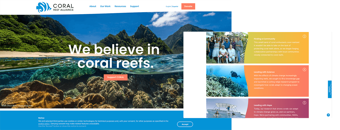
The Coral Reef Alliance works at local, regional, and global levels to keep coral reefs healthy, so they can adapt to climate change and survive for generations to come.
Of all of the pages I looked at, this one was the only one with a homepage that is entirely graphic-based. I love it. The illustration style is really neat and helps them relay messages through visuals that may not be available or as accurate with a photo. These graphics were a lot of work for some lucky designer, but I think it paid off because their site doesn’t look like anyone else’s.

Carbon 180 works with policymakers, entrepreneurs, and peer organizations across the US to design policies that will bring necessary carbon removal solutions to gigaton scale.
I immediately loved this site because it gave me something to instantly engage with when I landed on the home page– a play button with sounds from the rainforest. Not only is this neat because I’m whisked away to the rainforest, but it ties into their mission of using a bio-acoustic monitoring system which “combines the power of eco-acoustics, AI, and their team of experts to leverage acoustic technology systems to enable the protection and preservation of threatened ecosystems and endangered species. Their logo, while nothing extremely noteworthy, is simple and does a good job of representing sound (with the waves/circles) and the forest (leaf).
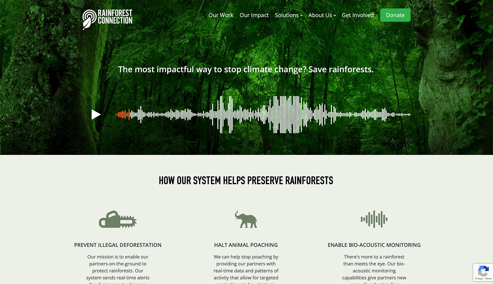
Rainforest Connection (RFCx) builds and deploys scalable, open acoustic monitoring systems that can halt illegal logging and poaching, and can enable biodiversity measurement and monitoring.
Let’s start with how memorable the logo is – don’t miss the heart shape in the mom’s polar bear arms. Brilliant! Strong photography and the composition of the copy overlaying the hero image on the home page is very satisfying and creates a great flow. Simple layout. Good flow. And WOW are the bears cute!

Polar Bears International’s mission is to conserve polar bears and the sea ice they depend on. They also work to inspire people to care about the Arctic, the threats to its future, and the connection of this fragile ecosystem to our global climate.
Honorable mention:
That was fun! I hope you found this list valuable and inspiring. Figuring out websites and branding can be hard stuff, but getting it all dialed is so worthwhile because it will help your organization stand out among the rest and make your cause memorable.
The designs and content featured in these examples are the sole property of their respective creators and authors. High Mountain Creative does not claim ownership to these website examples in any way.

I’m Margo! A graphic designer who works with conservation-minded nonprofits and brands on projects like logos & branding, annual reports, maps, and infographics. If your nonprofit is due for a brand refresh or logo redesign, I’m your gal! Visit my portfolio to see some of my work with other nonprofits and let’s schedule a call so I can learn more about your project.