Easy Guide to Make Your Brand’s Color Palette Accessible
Understanding accessibility and incorporating these practices into your brand can be really overwhelming.
If you’re just getting started with accessibility, it might feel like you have a lot of work to do to make sure your website and marketing materials are functional and easy-to-use for people with disabilities. There’s paragraph tagging (H1, H2, H3, etc), color contrast ratios, font size & style considerations, alt text and reading order for when a screen reader dictates your content to a visually impaired person, the list goes on. It sounds like a lot of work because it is and because, for a lot of us, it means re-learning certain skills and reevaluating our processes.
When I took on my first accessible design project, it had a pretty big scope – a 60-page document with page after page of charts, forms and images (the hardest elements to make accessible) and the final PDF needed to be Section 508 Compliant for a government agency. I was in way over my head, there were so many new variables and things to learn all at one time. I scrambled to watch YouTube videos, read articles and even had several consultations with an accessibility expert. I squeaked by and after I recovered from the stress and frustration I caused myself from taking on a project I was arguably underqualified for, I took a step back and realized I had some homework to do.
I told you that story so I could tell you this: start small on your accessibility journey and focus on learning and perfecting one accessibility practice at a time.
That said, let’s start with the one aspect of your brand that is highly visible to all of your audience: your brand colors. Creating an accessible brand color palette means making sure the colors you use have enough contrast between the foreground and background colors and that the colors can be seen by people with color blindness and low vision. This is primarily intended for typography and graphics or iconography. To learn more about why this is important, check out this resource from accessibility.digital.gov. Since there are a ton of great tools that help make creating an accessible color palette straightforward and painless, this is a good way to dip your toes into the accessibility pool.
Color Contrast Checker Tools
Web-Based (manually input color values to check contrast ratios)
Adobe Color Contrast Checker - manually input color values or upload graphics to check for appropriate color contrast
Web Accessibility Evaluation Tools
WAVE from webaim.org - identifies accessibility and Web Content Accessibility Guideline (WCAG) errors on your website
Color Blindness Stimulators (install these on your computer and check colors on any application on your computer)
Adobe Illustrator - a built in tool that runs within the application, go to View > Proof Setup > Color Blindness
Color Accessible Color Palette Generator
Venngage's Accessible color palette generator - view random palettes or plug in a HEX code as a baseline to generate accessible color palettes
It’s a good idea to check every possible color combination of all your brand colors – sometimes a color combination passes for accessibility but it’s not necessarily an aesthetically pleasing combo or a one that feels on-brand for you. In other words, don’t get cornered into ugly or limited color combos just because they’re the only colors that are accessible. If you’re in the process of branding or rebranding, bake this practice into your process and create as many accessible color combos as possible in your color palette.
Color Contrast “Case Studies”
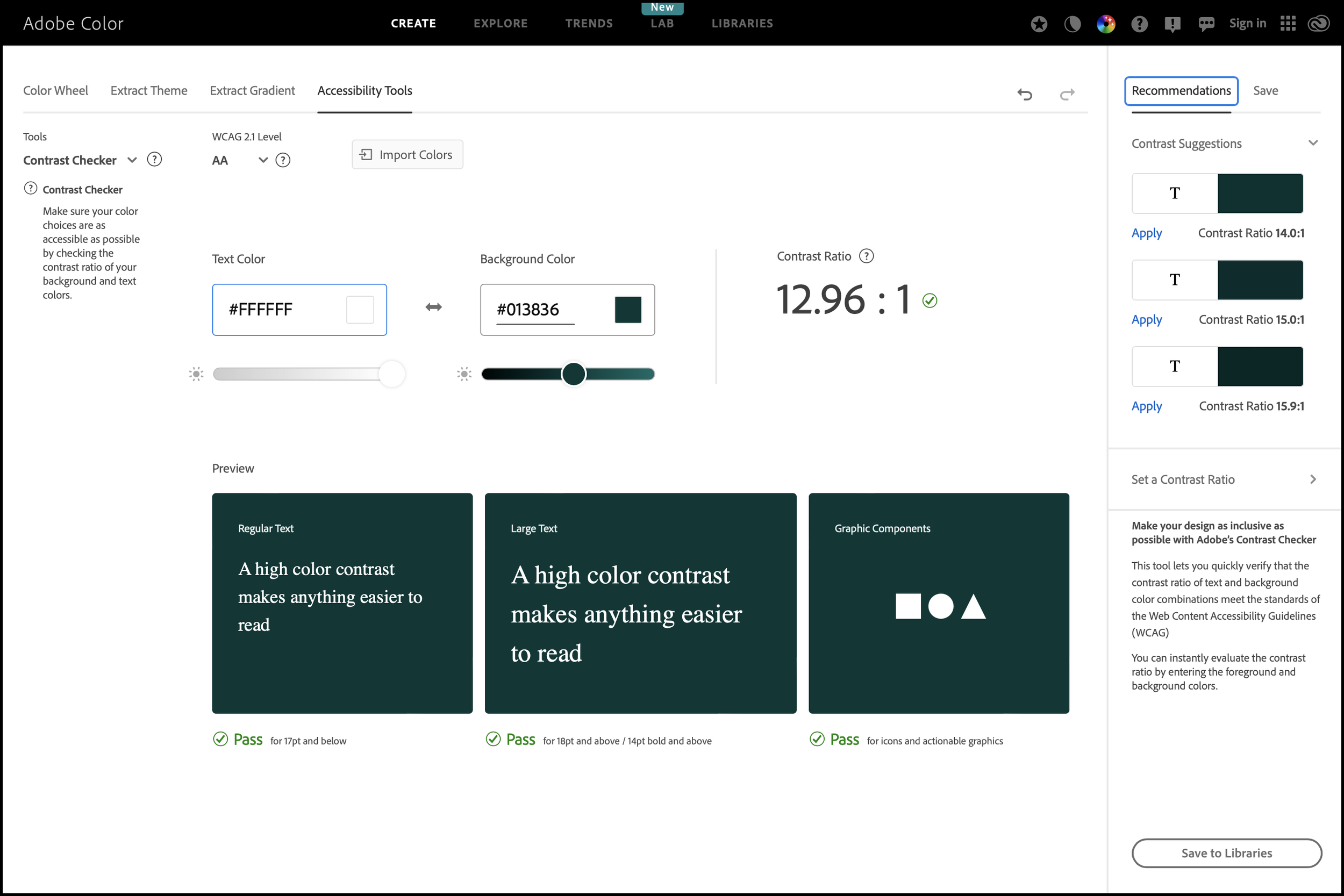
Using Adobe Color Contrast Checker, I’m able to see that this is a strong color combination because it can be used across the board for small text, large text and graphic components.
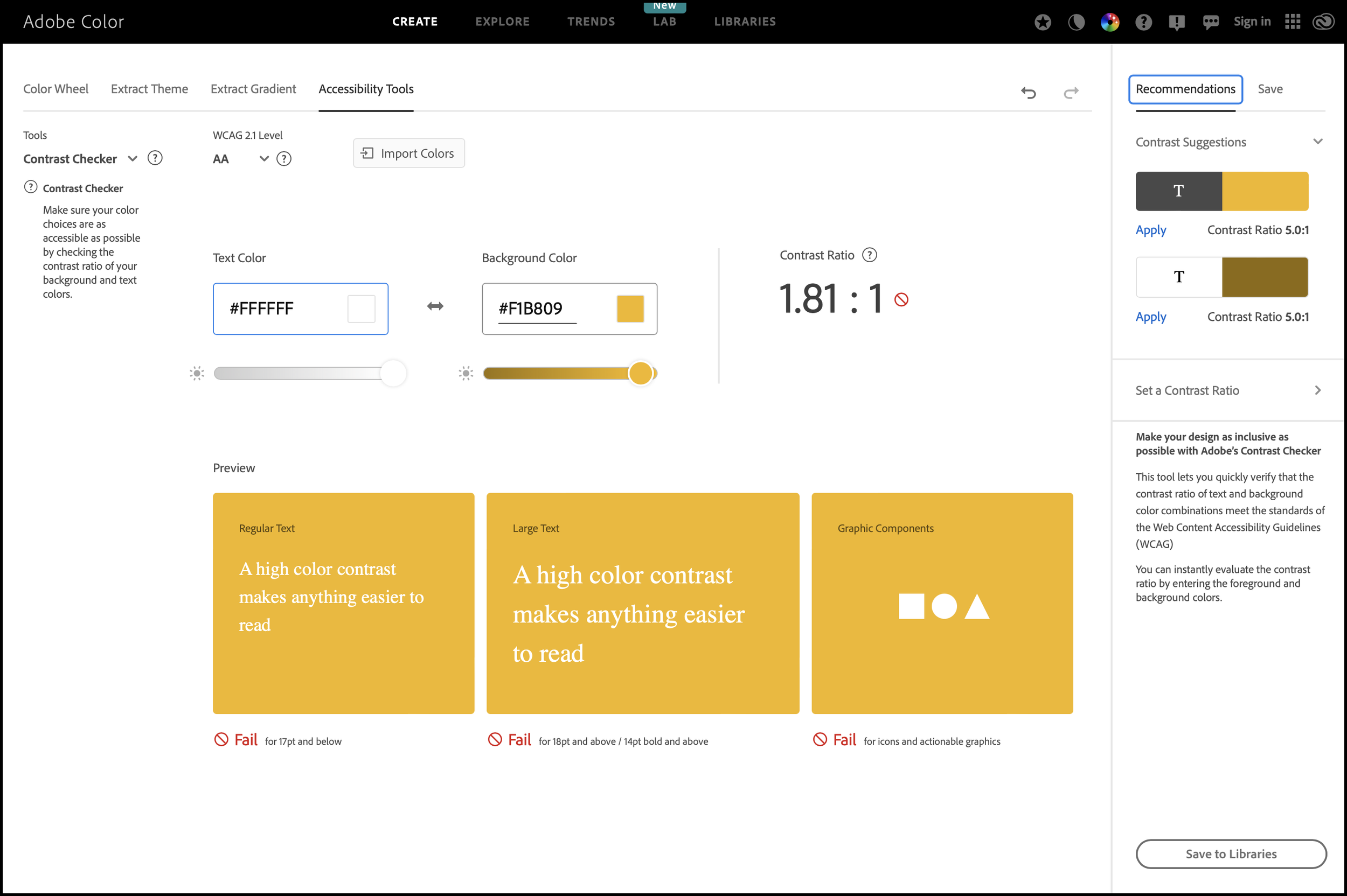
When I check this color combination, I can see that it doesn’t pass for any application of text or graphics. If you have colors like this in your existing brand color palette, consider using the color for non-essential elements.
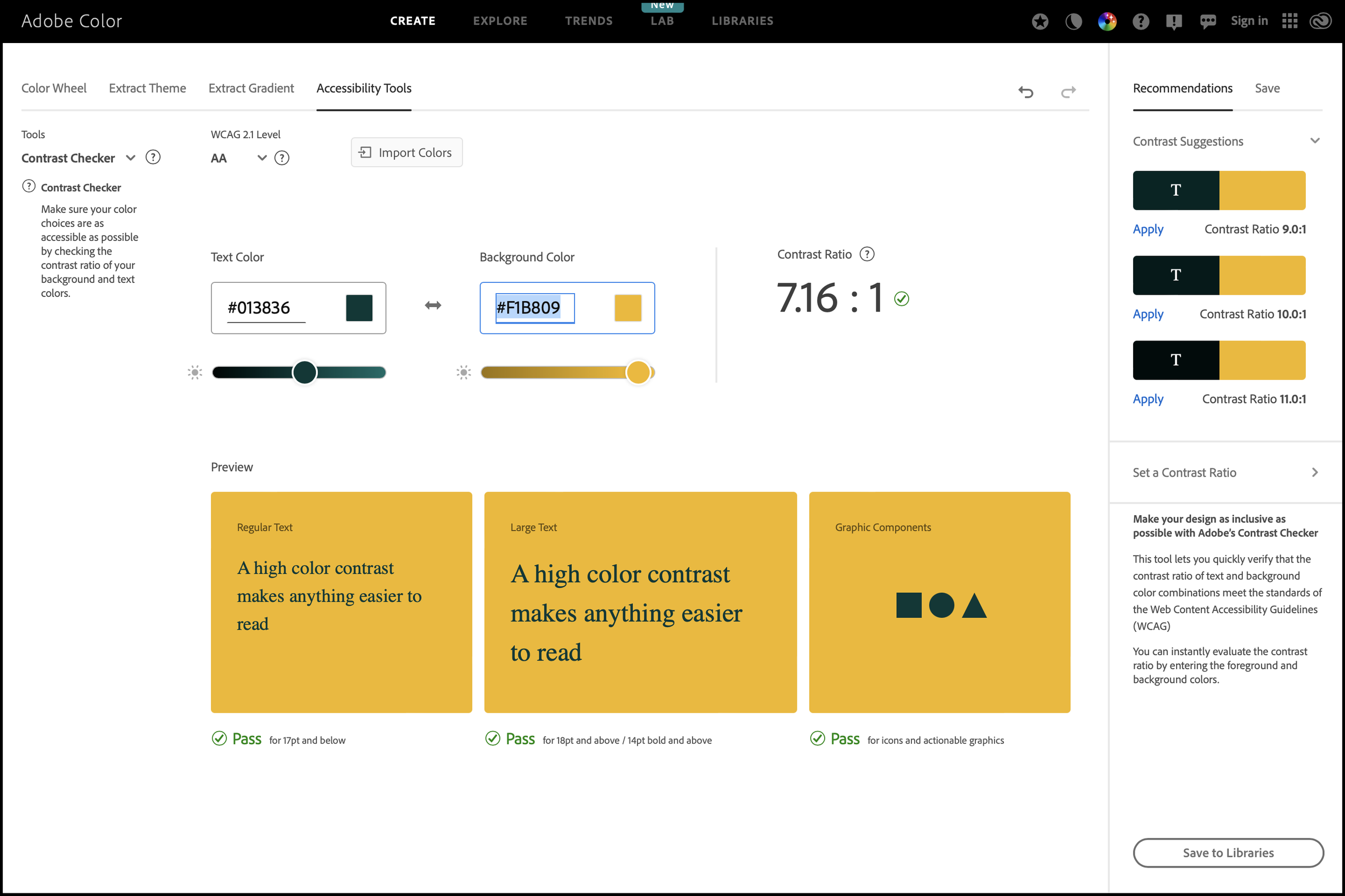
This is an example of two brand colors that effectively pass the color contrast text, but it’s not necessarily an aesthetically pleasing color palette.
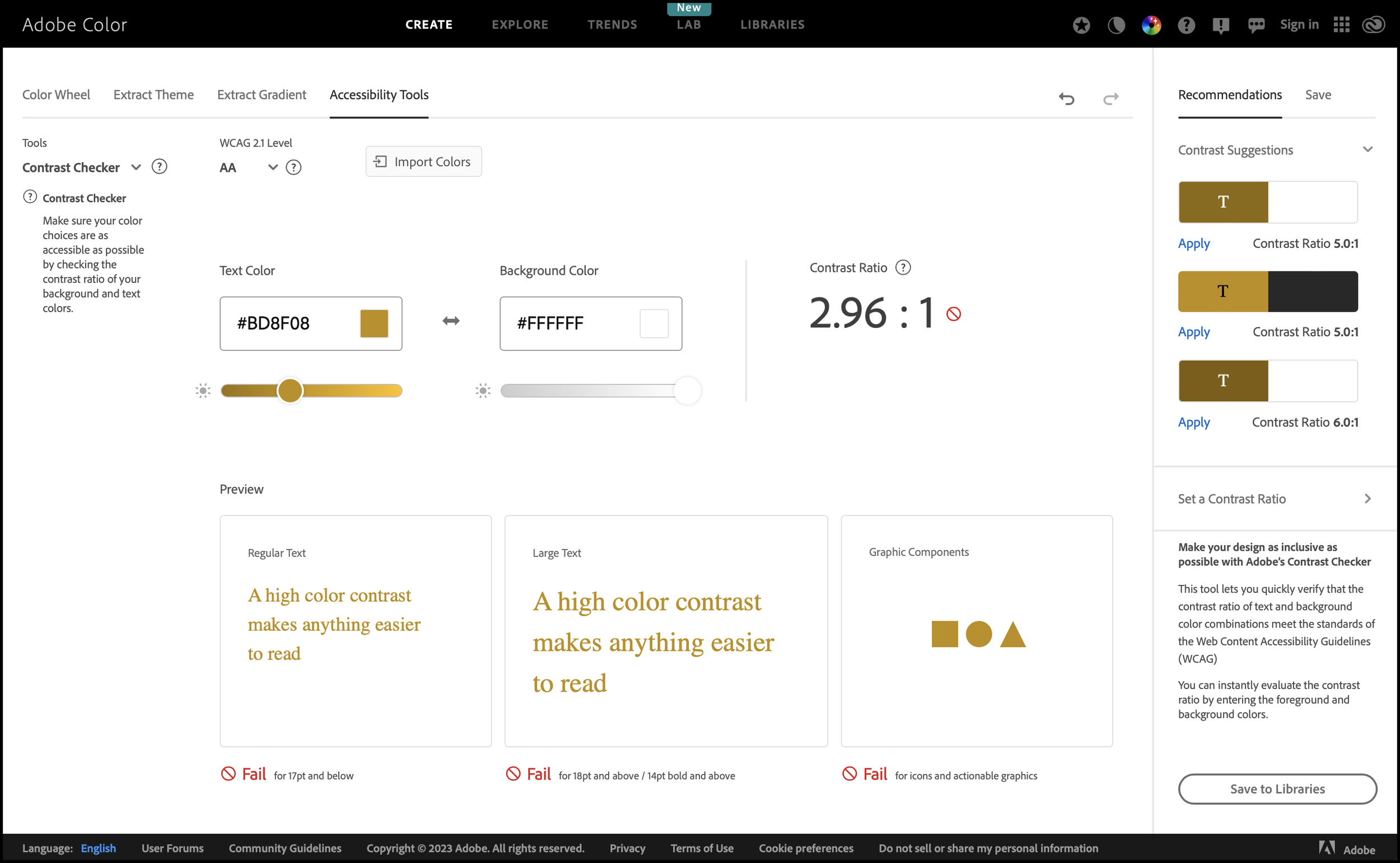
I call these color combinations “false friends” because, to a lot of people, the text color seems dark enough to provide proper contrast against the background. That’s why it’s important to use tools to stimulate color blindness or check color contrast ratios.
Building Accessibility Into Your Brand Styleguide
So now what? Make a plan to communicate accessible brand color combinations with your team and anyone who works on your brand. The easiest way to do this is to create a 2-3 page color accessibility guide or add a page to your existing brand styleguide with some high-level education on why color accessibility is important along with guidance on acceptable color combinations for small and large text and graphics.
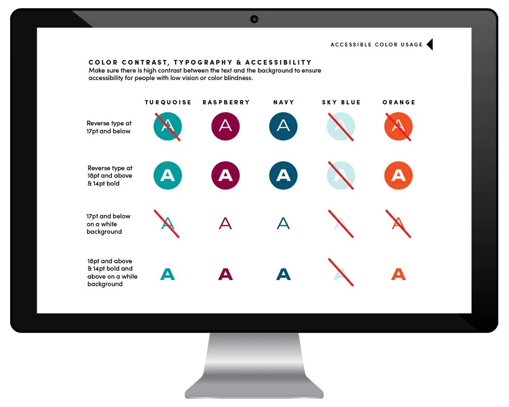
Example of an accessible color palette in a brand styleguide
In conclusion, don’t bite off more than you can chew and use the tools at your disposal to make good choices about brand colors so that your users and audience can have a good experience while interacting with your brand!

I’m Margo! A graphic designer who works with conservation-minded nonprofits and brands on projects like logos & branding, annual reports, maps, and infographics. I work with my clients to create beautiful and meaningful design that amplifies the marketing efforts it takes to ignite action and change. Visit my portfolio to see some of the projects I’ve collaborated on with nonprofits to protect the environment.